1. Introducing Dandelion-Datatables
1.1. What is Dandelion-Datatables?
Dandelion-Datatables is the first and most advanced component of the Dandelion framework.
It allows you to quickly create full-featured HTML tables based on the amazing DataTables jQuery plugin authored by Allan Jardine.
1.2. Features overview
Dandelion-Datatables support almost all native features of DataTables and adds more. Listed below are some of the key features:
-
Basic operations like sorting, filtering, paging, …
-
DOM and AJAX sources
-
Server-side processing
-
Theming: Bootstrap 2, Bootstrap 3 and jQueryUI
-
Fully customizable exports (XLS, XLSX, PDF, XML, …)
-
I18n
-
Integration with Spring and other projects
-
Support for both template engines: JSP and Thymeleaf
-
Easily extensible
2. Requirements
-
Java Runtime Environment 6+
-
Servlet 3.0+ container such as Jetty 8.x, Tomcat 7.x, JBoss AS 6, Weblogic Server 12c…
3. Installation
3.1. Known issues
-
You can’t use the Dandelion-Datatables' dialect inside a Thymeleaf fragment (#28)
3.2. Common installation steps
The list below covers the common steps across all supported template engines.
-
Step 1: Add the server-side dependency
Depending on the template engine you wish to use in your web application, add either datatables-jsp or datatables-thymeleaf to your project’s dependencies.
<dependency>
  <groupId>com.github.dandelion</groupId>
  <artifactId>datatables-jsp</artifactId>
  <version>1.0.1</version>
</dependency><dependency>
<groupId>com.github.dandelion</groupId>
<artifactId>datatables-thymeleaf</artifactId>
<version>1.0.1</version>
</dependency>-
Step 2: Configure the Dandelion filter
Add the following configuration to your web.xml file:
<!-- Dandelion filter definition and mapping -->
<filter>
  <filter-name>dandelionFilter</filter-name>
  <filter-class>com.github.dandelion.core.web.DandelionFilter</filter-class>
</filter>
<filter-mapping>
  <filter-name>dandelionFilter</filter-name>
  <url-pattern>/*</url-pattern>
  <dispatcher>REQUEST</dispatcher> (1)
  <dispatcher>FORWARD</dispatcher>
  <dispatcher>INCLUDE</dispatcher>
  <dispatcher>ERROR</dispatcher>
</filter-mapping>| 1 | Note that all dispatcher types should be specified in order for the filter to work in any situation. |
Add the following configuration to your web.xml file:
<!-- Dandelion servlet definition and mapping -->
<servlet>
  <servlet-name>dandelionServlet</servlet-name>
  <servlet-class>com.github.dandelion.core.web.DandelionServlet</servlet-class>
</servlet>
<servlet-mapping>
  <servlet-name>dandelionServlet</servlet-name>
  <url-pattern>/dandelion-assets/*</url-pattern> (1)
</servlet-mapping>| 1 | Note that the URL pattern can be customized thanks to the asset.url.pattern config option |
3.3. JSP-based steps
-
Declare the taglib definition
Everywhere you want to display a table using Dandelion-DataTables, you need to add the taglib definition in your JSP:
<%@ taglib prefix="datatables" uri="http://github.com/dandelion/datatables" %>
3.4. Thymeleaf-based steps
-
Declare the Thymeleaf dialect
If you’re using Spring/Spring MVC, update the SpringTemplateEngine bean as follows:
<bean id="templateEngine" class="org.thymeleaf.spring3.SpringTemplateEngine">
  <property name="templateResolver" ref="templateResolver" />
  <property name="additionalDialects">
    <set>
      <bean class="com.github.dandelion.datatables.thymeleaf.dialect.DataTablesDialect" />
    </set>
  </property>
</bean>
Otherwise, add the DataTablesDialect to your existing Thymeleaf template engine like this:
...
TemplateEngine templateEngine = new TemplateEngine();
templateEngine.addDialect(new DataTablesDialect());
...-
Declare the Thymeleaf namespace
<html xmlns:th="http://www.thymeleaf.org" xmlns:dt="http://github.com/dandelion/datatables">This way you can benefit from some content assist in your favorite IDE:
-
Eclipse: see the Thymeleaf Eclipse plugin
-
IntelliJ IDEA: see this topic
| Using a wrong namespace will prevent the content assist from working correctly |
3.5. Client-side dependencies
Actually you won’t need anything else to start working with Dandelion-Datatables since the component embeds a set of vendor bundles that pull the required client-side dependencies, such as DataTables and jQuery, from a CDN.
This simply means that once the above installation steps performed, it just works.
Of course, you may wish to use your own assets instead. In this situation, you have several options:
-
You may want to use Dandelion-Datatables as a standalone library, i.e. without all vendor bundles. See the standalone mode section for more information.
-
Or you may need to make a more fine-tuned configuration of the vendor assets. See the adapting vendor assets section for more information.
4. Basic features
4.1. Data sources
DataTables can obtain data from four different fundamental sources. Listed below are all data sources currently supported by Dandelion-Datatables.
| Data source type | Supported by Dandelion-Datatables | More information |
|---|---|---|
HTML document (DOM) |
See the |
|
JavaScript (array / objects) |
See #265 |
|
AJAX sourced data with client-side processing |
See the |
|
AJAX sourced data with server-side processing |
See the |
4.2. Feature enablement
Basic features such as sorting, paging, or filtering can be easily enabled/disabled using the corresponding table attributes.
You can see below all the features you can enable/disable by setting its value to true/false.
| Features | JSP attributes | Thymeleaf attributes |
|---|---|---|
Sorting |
||
Filtering (Global top right input field) |
||
Paging |
||
Info ("Showing 1 to 10 of 200 entries") |
||
Length change (top left drop down list) |
| Note that all above features are enabled by default. |
Using JSP
For instance, using JSP, you can set the sortable table attribute to false to disable sorting.
<datatables:table id="myTableId" data="${persons}" sortable="false">
  ...
</datatables:table>
Using Thymeleaf
Using Thymeleaf, set the dt:sortable table attribute to false.
<table id="myTable" dt:table="true" dt:sortable="false">
  ...
</table>
4.3. DOM positioning
When customising DataTables for your own usage, you might find that the default position of the feature elements (filter input etc) is not quite to your liking. Dandelion-Datatables leverages the DOM positioning feature of DataTables which is used to indicate where you wish particular features to appear in the DOM. You can also specify div wrapping containers (with classes) to provide complete layout flexibility.
The syntax available is:
-
l - Length changing
-
f - Filtering input
-
t - The table!
-
i - Information
-
p - Pagination
-
r - pRocessing
-
< and > - div elements
-
<"class" and > - div with a class
Since the v0.10.0, you can make use of this feature to configure your own control. See the extra HTML section for more details.
Using JSP
You can use the dom table attribute.
In the following example, all controls are disabled. Only the table is displayed.
<datatables:table id="myTableId" data="${persons}" dom="t">
  ...
</datatables:table>
Using Thymeleaf
Use the dt:dom table attribute as follows:
<table id="myTableId" dt:table="true" dt:dom="t">
  ...
</table>
Note that with the available parsers, you won’t be able to directly use more complex expressions such as <"class"t> because some characters like < are not allowed.
If you do need expression like the above, use the properties trick as follows:
-
In your properties file associated with your template, add a new property for the
domvalue:myTableId.dom=<"myCSSClass"t> -
Then use the created property in your template (more info here):
<table id="myTableId" dt:table="true" dt:dom="#{myTableId.dom}">
   ...
</table>
4.4. Changing display length
By default, DataTables display 10 rows. You can of course configure this number.
Using JSP
You can use the displayLength table attribute.
<datatables:table id="myTableId" data="${persons}" displayLength="40">
  ...
</datatables:table>
Using Thymeleaf
With Thymeleaf, you can use the dt:displayLength table attribute.
<table id="myTableId" dt:table="true" dt:displaylength="40">
  ...
</table>
4.5. Using implicit objects
Dandelion-Datatables make some implicit objects available in the scope of the page.
4.5.1. Accessing the object being iterated on
It can be handy if you need to display a bit more than just a raw property.
Using JSP
You will be able to access the object being iterated on thanks to the row table attribute. Just give a name under which you will refer the object in column bodies.
<datatables:table id="myTableId" data="${persons}" row="person"> (1)
  <datatables:column title="Mail">
    <a href="mailto:${person.mail}">${person.mail}</a> (2)
  </datatables:column>
</datatables:table>| 1 | A variable named person is created and contains the object being iterated on |
| 2 | You can then access the object inside a column body |
Using Thymeleaf
Actually, Dandelion-Datatables brings nothing here. Thymeleaf already allows you to access the object being iterated on thanks to the th:each attribute. See the documentation for more details.
<table id="myTableId" dt:table="true">
  <thead>
    <tr>
      <th>Mail</th>
    </tr>
  </thead>
  <tbody>
    <tr th:each="person : ${persons}">
      <td><a th:href="${'mailto:' + person.mail}" th:text="${person.mail}">john@doe.com</a></td>
    </tr>
  </tbody>
</table>
4.5.2. Accessing the current row index
Using JSP
Dandelion-Datatables makes available the row index through the row table attribute. The object accessed thanks to this attribute has a property called _rowIndex. Just use it as follows:
<datatables:table id="myTableId" data="${persons}" row="person">
  <datatables:column title="Row index">
    Row index : <c:out value="${person_rowIndex}" />
  </datatables:column>
</datatables:table>
Using Thymeleaf
Once again, Dandelion-Datatables adds nothing here. Thymeleaf already offers a mechanism useful for keeping track of the status of the iteration. See more details here.
<table id="myTableId" dt:table="true">
  <thead>
    <tr>
      <th>Row index</th>
    </tr>
  </thead>
  <tbody>
    <tr th:each="person,iterStat : ${persons}">
      <td th:text="${iterStat.index}">0</td>
    </tr>
  </tbody>
</table>
4.5.3. Accessing the DataTable configuration
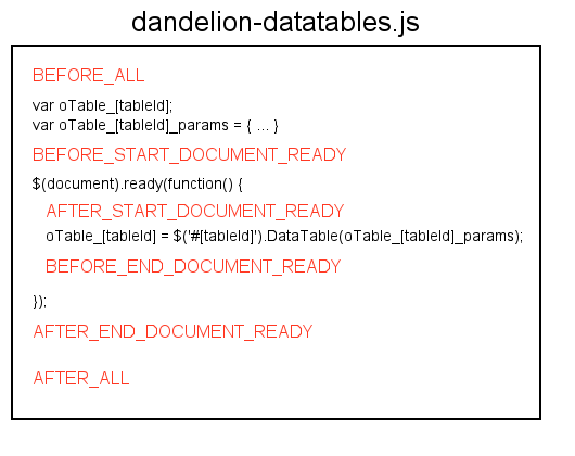
The last objects available are Javascript ones: the DataTable object and the configuration to be used when initializing DataTable.
Indeed, whether you use the JSP taglib or the Thymeleaf dialect, Dandelion-Datatables generates the DataTable configuration using the table’s id as follows:
var oTable_[tableId] = $('#[tableId]');
var oTable_[tableId]_params = {...};
$(document).ready(function(){
  oTable_[tableId] = $('#[tableId]').dataTable(oTable_[tableId]_params);
});
This means you can access the created DataTable object through the variable oTable_[tableId] but also the configuration to be applied to the table with the variable oTable_[tableId]_params.
See extra JavaScript section for usage examples.
4.6. Sorting data
4.6.1. Individual column sorting
We have seen in feature enablement section that global sorting can be enabled/disabled. But you can also enable/disable sorting on individual columns.
Using JSP
You can enable/disable the sorting feature in a specific column using the sortable column attribute:
<datatables:table id="myTableId" data="${persons}">
  <datatables:column property="id" sortable="false" /> (1)
  <datatables:column property="firstName" />
  <datatables:column property="lastName" />
  <datatables:column property="address.town.name" />
  <datatables:column property="mail" sortable="false" /> (1)
</datatables:table>| 1 | Sorting in the first and last columns is now impossible |
Using Thymeleaf
You can enable/disable the sorting feature in a specific column using the dt:sortable th attribute.
<table id="myTableId" dt:table="true">
  <thead>
    <tr>
      <th dt:sortable="false">Id</th> (1)
      <th>Firstname</th>
      <th>Lastname</th>
      <th>City</th>
      <th>Mail</th>
    </tr>
  </thead>
  <tbody>
    <tr th:each="person : ${persons}">
      <td th:text="${person.id}">1</td>
      <td th:text="${person.firstName}">John</td>
      <td th:text="${person.lastName}">Doe</td>
      <td th:text="${person.address.town.name}">Nobody knows!</td>
      <td th:text="${person.mail}">john@doe.com</td>
    </tr>
  </tbody>
</table>| 1 | Sorting in the first column is now impossible |
4.6.2. Sorting initialization
Sorting can of course be initialized in many ways in individual columns.
4.6.2.1. Default initialization order
Using JSP
Use the sortInitDirection column attribute, with either asc or desc as possible values, on each column you want sorting to be initialized.
<datatables:table id="myTableId" data="${persons}">
  <datatables:column title="Id" property="id" sortable="false" />
  <datatables:column title="FirstName" property="firstName" sortInitDirection="desc" /> (1)
  <datatables:column title="LastName" property="lastName" />
  <datatables:column title="City" property="address.town.name" sortInitDirection="asc" /> (2)
 <datatables:column title="Mail" property="mail" sortable="false" />
</datatables:table>| 1 | Sorting is first initialized in the second column |
| 2 | Another sorting is then initialized in the fourth column |
Using Thymeleaf
Use the sortInitDirection th attribute with either asc or desc as possible values.
<table id="myTableId" dt:table="true">
  <thead>
    <tr>
      <th >Id</th>
      <th dt:sortInitDirection="desc">Firstname</th>
      <th>Lastname</th>
      <th dt:sortInitDirection="asc">City</th>
      <th>Mail</th>
    </tr>
  </thead>
  ...
</table>| Note that by default, columns are initialized in a sequential order, i.e. in the order columns are defined. |
4.6.2.2. Custom initialization order
As explained in the previous section, sorting is by default initialized in the order columns are defined. But you may need to change that.
Using JSP
The initialization order can be changed using the sortInitOrder column attribute. Just set the index in which you want the column to be initialized, starting from 0.
<datatables:table id="myTableId" data="${persons}">
  <datatables:column title="Id" property="id" />
  <datatables:column title="FirstName" property="firstName" sortInitDirection="asc" sortInitOrder="1" /> (2)
  <datatables:column title="LastName" property="lastName" sortInitDirection="desc" sortInitOrder="0" /> (1)
  <datatables:column title="City" property="address.town.name" />
  <datatables:column title="Mail" property="mail" />
</datatables:table>| 1 | The lastName column is first initialized in the desc direction |
| 2 | Then the firstName column, in the asc direction |
Using Thymeleaf
The initialization order can be changed using the dt:sortInitOrder th attribute. Just set the index in which you want the column to be initialized, starting from 0.
<table id="myTableId" dt:table="true">
  <thead>
    <tr>
      <th >Id</th>
      <th dt:sortInitDirection="asc" dt:sortInitOrder="1">Firstname</th>
      <th dt:sortInitDirection="desc" dt:sortInitOrder="0">Lastname</th>
      <th>City</th>
      <th>Mail</th>
    </tr>
  </thead>
  ...
</table>
4.6.3. Sorting functions
Dandelion-Datatables uses a type based column sorting among the available DataTables APIs. It means the default sorting functions will be used in all columns unless you specify a specific sorting function name to be applied on a particular column.
4.6.3.1. Available sorting functions
Since the v0.9.0, Dandelion-Datatables supports the following sorting functions:
| Sorting function | Description | JSP syntax | Thymeleaf syntax |
|---|---|---|---|
Alt string |
Use the |
|
|
Anti-"the" |
Sort with the prefixed word |
|
|
Chinese (String) |
Sort Chinese characters |
|
|
Date-de |
Sort date / time in the format |
|
|
Date-eu |
Sort dates in the format |
|
|
Date-euro |
Sort date / time in the format |
|
|
Date-uk |
Sort dates in the format |
|
|
Filesize |
Sort abbreviated file sizes correctly (8MB, 4KB, etc) |
|
|
IP addresses |
Sort IP addresses numerically |
|
|
Natural sorting |
DataTables implementation of the naturalSort() function by Jim Palmer. With this one, you can sort on simple numerics, floats, filenames, dates, currency, … Long story short, this sorting function should cover the majority of your needs. |
|
|
Persian |
Sort Persian strings alphabetically |
|
|
Scientific |
Sort data which is written in exponential notation |
|
|
Fully signed numbers |
Sort data numerically with a leading |
|
|
Turkish |
Sort Turkish characters |
|
|
Using JSP
You can activate a sorting function on a column using the sortType column attribute.
<datatables:table id="myTableId" data="${persons}" row="person">
  <datatables:column title="Id" property="id" />
  <datatables:column title="FirstName" property="firstName" />
  <datatables:column title="LastName" property="lastName" />
  <datatables:column title="City" property="address.town.name" />
  <datatables:column title="Mail" sortType="natural">
    <a href="mailto:${person.mail}">${person.mail}</a>
  </datatables:column>
  <datatables:column title="Birthdate" property="birthDate" format="{0,date,dd/MM/yyyy}" sortType="date" />
  <datatables:column title="Pocket money" sortType="natural">
    ${person.pocketMoney}€
  </datatables:column>
  <datatables:column title="Company" property="company.name" />
</datatables:table>
Using Thymeleaf
You can activate a sorting function on a column using the dt:sortType th attribute.
<table id="myTableId" dt:table="true">
<thead>
<tr>
<th>Id</th>
<th>FirstName</th>
<th>LastName</th>
<th>City</th>
<th dt:sortType="natural">Mail</th>
<th dt:sortType="natural">Birthdate</th>
<th dt:sortType="natural">Pocket money</th>
<th>Company</th>
</tr>
</thead>
<tbody>
<tr th:each="person : ${persons}">
<td th:text="${person.id}">1</td>
<td th:text="${person.firstName}">John</td>
<td th:text="${person.lastName}">Doe</td>
<td th:text="${person.address.town.name}">Nobody knows!</td>
<td th:text="${person.mail}">john@doe.com</td>
<td th:text="${#dates.format(person.birthDate, 'dd/MM/yyyy')}">12/12/2012</td>
<td th:text="${person.pocketMoney + '€'}">1000€</td>
<td th:text="${person.company.name}">Company</td>
</tr>
</tbody>
</table>
----4.7. Filtering data
In order to filter data, Dandelion-Datatables uses the great YADCF plugin authored by Daniel Reznick. This plugin, which works on top of DataTables, will be automatically added as a new dependency as soon as a filtering feature is enabled.
4.7.1. Using input fields
As soon as you activate individual column filtering, Dandelion-Datatables will generate the corresponding fields that allow to filter each column of the table.
By default, input fields will be generated in the corresponding tfoot cell.
Using JSP
Set the filterable column attribute to true.
<datatables:table id="myTableId" data="${persons}">
   ...
   <datatables:column title="FirstName" property="firstName" filterable="true" />
   ...
</datatables:table>
Using Thymeleaf
With Thymeleaf, set the dt:filterable th attribute to true to enable input-based filtering.
<table id="myTableId" dt:table="true">
   <thead>
      <tr>
         ...
         <th dt:filterable="true">FirstName</th>
         ...
      </tr>
   </thead>
   ...
</table>| Note that you can change the location of filtering elements. See filtering placeholders section for more details. |
4.7.2. Using drop-down lists
Instead of the default input fields, you can choose to display drop-down lists.
4.7.2.1. Using the default drop-down list
Using JSP
Set the filterType column attribute to select (which defaults to input).
<datatables:table id="myTableId" data="${persons}">
   ...
   <datatables:column title="FirstName" property="firstName" filterable="true" filterType="select" />
   ...
</datatables:table>
Using Thymeleaf
With Thymeleaf, set the dt:filterType th attribute to select (which defaults to input).
<table id="myTableId" dt:table="true">
   <thead>
      <tr>
         ...
         <th dt:filterable="true" dt:filterType="select">FirstName</th>
         ...
      </tr>
   </thead>
   ...
</table>
By default, Dandelion-Datatables will generate a drop-down list and create as many options as entries in the corresponding column (minus duplicates).
It is worth noting that the default drop-down lists (generated with the select filter type)
are only compatible with DOM sources and AJAX sources (without
server-side processing). For AJAX sources with server-side processing,
this the section below.
|
4.7.2.1. Using drop-down lists with predefined values
Instead of letting Dandelion-Datatables fill the filtering drop-down lists automatically, you may need to display predefined values.
For this purpose, you can use the filterValues column attribute (JSP) / dt:filterValues th attribute (Thymeleaf) and pass any array of strings. Array of objects also works.
Example
Assuming the following asset bundled in the filtering bundle:
{
  "assets":[
    {
      "locations":{
        "webapp":"/assets/js/filtering.js"
      }
    }
  ]
}
The array can contain plain Strings or array of objects:
var arrayOfStrings = [ "1", "2" ];
// or
var arrayOfObjects = [{ "value" : "1", "label" : "One"} , { "value" : "2", "label" : "Two"}];
Finally, use the dt:filterValues th attribute as follows:
<table id="myTableId" dt:table="true">
  <thead>
    <tr>
      <th>Id</th>
      <th>FirstName</th>
      <th>LastName</th>
      <th dt:filterable="true" dt:filterType="select" dt:filterValues="filtering#arrayOfObjects">City</th> (1)
      <th>Mail</th>
    </tr>
  </thead>
  ...
</table>| 1 | Note that the filtering bundle is automatically included into the request thanks to the bundle-name#javaScriptObject syntax. See the bundle special syntax for more details. |
| Note that these drop-down lists can be used with all types of data source: DOM, AJAX and AJAX + server-side processing. |
4.7.3. Filtering placeholders
You may have noticed that Dandelion-Datatables defaultly use the tfoot section of the table to place the filtering elements. Actually, you can choose where filtering elements will be inserted. Here follow the available placeholders:
| Placeholder | Description | JSP syntax | Thymeleaf syntax |
|---|---|---|---|
Footer |
All filtering elements will be inserted in the |
|
|
Header |
All filtering elements will be inserted in the existing |
|
|
None |
The table is left untouched, no row is added. Use this option to let Dandelion-Datatables generate filtering elements in an <a href="using-an-external-form.html">external form</a>. |
|
|
4.7.4. External form
At times, you might need to externalize all filtering elements out of the table. As shown above, you can the none filter placeholder.
4.7.4.1. Using filtering selectors
You can tell Dandelion-Datatables to inject filtering elements (such as input fields or drop-down lists) in externalized placeholders.
First give all placeholders an id.
<div id="firstNameFilter"></div>
<div id="lastNameFilter"></div>
<div id="cityFilter"></div>
Then, use the selector column attribute (JSP) / dt:selector th attribute (Thymeleaf). As value, just pass the DOM id of the element in which you want the filter element to be inserted.
Using JSP
<datatables:table id="myTableId" data="${persons}" filterPlaceholder="none">
  ...
  <datatables:column ... filterable="true" filterType="select" selector="firstNameFilter" />
  <datatables:column ... filterable="true" selector="lastNameFilter" />
  <datatables:column ... filterable="true" selector="cityFilter" />
  ...
</datatables:table>
Using Thymeleaf
<table id="myTableId" dt:table="true" dt:filterPlaceholder="none">
  <thead>
    <tr>
      <th>Id</th>
      <th dt:filterable="true" dt:filterType="select" dt:selector="firstNameFilter">Firstname</th>
      <th dt:filterable="true" dt:selector="lastNameFilter">Lastname</th>
      <th dt:filterable="true" dt:selector="cityFilter">City</th>
      <th>Mail</th>
    </tr>
  </thead>
  ...
</table>
4.7.4.2. Using the DataTables API
There is also an alternative way: use the fnFilter method of the DataTables API.
Indeed, as soon as you use the JSP taglib or the Thymeleaf dialect, Dandelion-Datatables makes available a global-scoped variable containing the DataTables under the name oTable_[tableId].
This means you can use the DataTables API with this variable.
Using JSP
Considering the following table:
<datatables:table id="myTableId" data="${persons}">
  <datatables:column title="Id" property="id" />
  <datatables:column title="FirstName" property="firstName" />
  <datatables:column title="LastName" property="lastName" />
  <datatables:column title="City" property="address.town.name" />
  <datatables:column title="Mail" property="mail" />
</datatables:table>
You could add an external search form as follows:
<form ...>
  <input type="text" name="value1" />
  <a onclick="doSearch();">Search</a>
</form>

<script>
  function doSearch(){
    oTable_myTableId.fnFilter($('#value1').val()); (1)
  }
</script>| 1 | Note that the table is accessed with the following oTable_myTableId variable. |
4.7.5. Exclude columns from global filtering
There are times when you might find it useful to exclude some columns from filtering.
Using JSP
Use the searchable column attribute. Set it to false to exclude the corresponding column from filtering.
<datatables:table id="myTableId" data="${persons}">
  ...
  <datatables:column title="FirstName" property="firstName" searchable="false" />
  ...
</datatables:table>
Using Thymeleaf
You can use the dt:searchable th attribute. Set it to false to exclude the corresponding column from filtering.
<table id="myTableId" dt:table="true">
  <thead>
    <tr>
      ...
      <th dt:searchable="false">Firstname</th>
      ...
    </tr>
  </thead>
  ...
</table>
4.7.6. Filtering on click
Since the v0.10.0, data filtering can be done not only on key press but also on button click whether, you use a DOM or an AJAX source.
Using JSP
You can use the filterSelector table attribute, which needs a jQuery selector.
<datatables:table id="myTableId" data="${persons}" dom="l0rtip" filterSelector="#filterButton" filterClearSelector="#filterClearButton">
  <datatables:column ... filterable="true" filterType="select" />
  <datatables:column ... filterable="true" />
  <datatables:column ... filterable="true" />
  <datatables:extraHtml uid="0" cssStyle="float:right;">
    <a id="filterButton" class="btn btn-primary">Apply filters</a>
    <a id="filterClearButton" class="btn btn-inverse">Clear filters</a>
  </datatables:extraHtml>
</datatables:table>
At initialization, Dandelion-Datatables will automatically bind a click event on the element targeted by the filterSelector attribute which will lead to a global filtering using all filled filtering elements.
To go a step further, note that you can do the same to clear the filters by assigning another jQuery selector to the element targeted by the filterClearSelector attribute.
Using Thymeleaf
You can use the dt:filterSelector table attribute to apply the filters and dt:filterClearSelector to clear them.
<div dt:conf="myTableId"> (1)
  <div dt:confType="extrahtml" dt:uid="0" dt:cssStyle="float:right;">
    <a id="filterButton">Apply filters</a>
    <a id="filterClearButton">Clear filters</a>
  </div>
</div>

<table id="myTableId" dt:table="true" dt:dom="l0rtip" dt:filterSelector="#filterButton" dt:filterClearSelector="#filterClearButton">
  <thead>
    <tr>
      <th dt:name="firstname" dt:filterable="true" dt:filterType="select">Firstname</th>
      <th dt:name="lastname" dt:filterable="true">Lastname</th>
      <th dt:name="city" dt:filterable="true">City</th>
    </tr>
  </thead>
  ...
</table>| 1 | See the configuration div for more details. |
4.7.7. Delayed filtering
Starting from the v0.10.0, all individual filtering actions can be delayed (in ms) to keep the browser more responsive. This can be particularly useful when working with server-side processing, where you wouldn’t typically want an AJAX request to be made with every key press the user makes when searching the table.
By default, the delay is set to 500ms.
Using JSP
Use the filterDelay table attribute to impact all filtering controls (except the global one).
<datatables:table id="myTableId" url="/persons" serverSide="true" filterDelay="1000">
  ...
</datatables:table>
Using Thymeleaf
Use the dt:filterDelay table attribute to impact all filtering controls (except the global one).
<table id="myTableId" dt:table="true" dt:url="@{/persons}" dt:serverside="true" dt:filterDelay="1000">
  ...
</table>| All filtering elements are impacted by the delay, except the global filtering control. |
4.8. Paging data
Dandelion-Datatables uses the extensible pagination mechanism of DataTables to offer different pagination style in an easy way.
Dandelion-Datatables supports the following pagination styles:
-
simple
-
simple_numbers
-
full
-
full_numbers
-
input
-
listbox
-
scrolling
-
extStyle
-
bootstrap_simple
-
bootstrap_full
-
bootstrap_full_numbers
Using JSP
Use the pagingType table attribute.
<datatables:table id="myTableId" ... pagingType="full_numbers">
  ...
</datatables:table>
Using Thymeleaf
Use the dt:pagingType table attribute.
<table id="myTableId" dt:table="true" ... dt:pagingType="full_numbers">
  ...
</table>
4.9. Scrolling
You may need to allow horizontal or vertical scrolling, e.g. when you have a wide table, with a large number of rows and/or columns to display.
4.9.1. Vertical scrolling
Using JSP
Use the scrollY table attribute.
<datatables:table id="myTableId" ... scrollY="200px" pageable="false">
  ...
</datatables:table>
Using Thymeleaf
You can use the dt:scrolly table attribute.
<table id="myTable" dt:table="true" ... dt:scrolly="200px" dt:pageable="false">
  ...
</table>| Disabling table pagination is not mandatory, it will work just fine with pagination enabled as well |
4.9.2. Horizontal scrolling
Using JSP
You can use the scrollX table attribute.
<datatables:table id="myTableId" ... scrollX="120%">
  ...
</datatables:table>
Using Thymeleaf
<table id="myTable" dt:table="true" ... dt:scrollx="120%">
  ...
</table>
4.10. Multiple tables on the same page
Dandelion-Datatables can display multiple tables on the same page.
<table id="myTableId" dt:table="true"> (1)
  <thead>
    <tr>
      <th>Id</th>
      <th>Firstname</th>
    </tr>
  </thead>
  <tbody>
    <tr th:each="person : ${persons}">
      <td th:text="${person?.id}">1</td>
      <td th:text="${person?.firstName}">John</td>
    </tr>
  </tbody>
</table>

<table id="myOtherTableId" dt:table="true"> (1)
  <thead>
    <tr>
      <th>Id</th>
      <th>Firstname</th>
    </tr>
  </thead>
  <tbody>
    <tr th:each="person : ${persons}">
      <td th:text="${person?.id}">1</td>
      <td th:text="${person?.firstName}">John</td>
    </tr>
  </tbody>
</table>| 1 | Just ensure to give a unique ID to each table. |
4.11. Handling null and defaults values
There are times when you might want to display a property that is actually null. There are multiple ways to handle this.
Using JSP
By default, Dandelion-Datatables displays an empty string when the property of the bean is null. But you can override the empty string using the default column attribute.
<datatables:table id="myTableId" data="${persons}">
  <datatables:column title="Id" property="id" />
  <datatables:column title="FirstName" property="firstName" />
  <datatables:column title="LastName" property="lastName" />
  <datatables:column title="City" property="address.town.name" default="Nothing to display!" />
  <datatables:column title="Mail" property="mail" />
</datatables:table>
Of course, you can also use some JSTL tags as follows:
<datatables:table id="myTableId" data="${persons}">
  <datatables:column title="Id" property="id" />
  <datatables:column title="FirstName" property="firstName" />
  <datatables:column title="LastName" property="lastName" />
  <datatables:column title="City">
    <c:choose>
      <c:when test="${address ne null and address.town ne null and address.town.name ne ''}">
        <c:out value="${address.town.name}" />
      </c:when>
      <c:otherwise>Nothing to display!</c:otherwise>
    </c:choose>
  </datatables:column>
  <datatables:column title="Mail" property="mail" />
</datatables:table>
Using Thymeleaf
Dandelion-Datatables doesn’t bring anything here. Just use a native conditionnal operator.
<table id="myTableId" dt:table="true">
  <thead>
    <tr>
      <th>Id</th>
      <th>Firstname</th>
      <th>Lastname</th>
      <th>City</th>
      <th>Mail</th>
    </tr>
  </thead>
  <tbody>
    <tr th:each="person : ${persons}">
      <td th:text="${person.id}">1</td>
      <td th:text="${person.firstName}">John</td>
      <td th:text="${person.lastName}">Doe</td>
      <td th:text="${person?.address != null and person.address.town != null} ? ${person.address.town.name} : 'Nothing to display!'">Nobody knows!</td>
         <td th:text="${person.mail}">john@doe.com</td>
      </tr>
   </tbody>
</table>
4.12. Customizing column headers
At times it can be useful to have some HTML code in a column header, for example to display a master checkbox.
Using JSP
This can be done using the <datatables:columnHead tag, which works hand-in-hand with the <datatables:column> tag.
As soon as you need to customize a column header, just wrap your custom code inside a <datatables:columnHead tag as follows:
<datatables:table id="myTableId" data="${persons}" row="person">
  <datatables:column title="Id" property="id" />
  <datatables:column title="FirstName" property="firstName" />
  <datatables:column title="LastName" property="lastName" />
  <datatables:column title="City" property="address.town.name" />
  <datatables:column title="Mail" property="mail" />
  <datatables:column sortable="false" cssCellStyle="text-align:center;">
    <datatables:columnHead> (1)
      <input type="checkbox" onclick="$('#myTableId').find(':checkbox').attr('checked', this.checked);" />
    </datatables:columnHead>
    <input type="checkbox" value="${person.id}" /> (2)
  </datatables:column>
</datatables:table>| 1 | Anything inside the <datatables:columnHead tag will be displayed in the column header |
| 2 | Anything else will be used for each cell’s contents |
Using Thymeleaf
Nothing’s specific is needed with Thymeleaf since you have natively a full control over the thead section of the table.
<table id="myTableId" dt:table="true">
  <thead>
    <tr>
      <th>Id</th>
      <th>Firstname</th>
      <th>Lastname</th>
      <th>City</th>
      <th>Mail</th>
      <th dt:sortable="false">
        <input type="checkbox" onclick="$('#myTableId').find(':checkbox').attr('checked', this.checked);" />
      </th>
    </tr>
  </thead>
  <tbody>
    <tr th:each="person : ${persons}">
      <td th:text="${person.id}">1</td>
      <td th:text="${person.firstName}">John</td>
      <td th:text="${person.lastName}">Doe</td>
      <td th:text="${person.address.town.name}">Nobody knows !</td>
      <td th:text="${person.mail}">john@doe.com</td>
      <td style="text-align:center;">
        <input type="checkbox" th:value="${person.id}" />
      </td>
    </tr>
  </tbody>
</table>
5. Styling
There are a number of ways in which DataTables allows you to style tables and HTML it adds to the document. Dandelion-DataTables supports some of them but also provides themes integration for Bootstrap or jQueryUI.
5.1. Basics
Both JSP taglib and Thymeleaf dialect provide attributes that can style different elements: the table, the row, header cells, …
The table below lists all possibilities.
| Applies to | JSP | Thymeleaf | Description |
|---|---|---|---|
the table ( |
|
Inlined style or CSS class(es) |
|
the rows ( |
Sequence of CSS classes that will be selected sequentially, looping when required |
||
the header cells ( |
|
Applies style or CSS class(es) |
|
all other cells ( |
|
Example using JSP
<datatables:table id="myTableId" ... cssClass="myClass" cssStripes="myOdd,myEven">  (1) (2)
  <datatables:column title="Id" property="id" cssClass="myColumn1Class" /> (3)
  ...
</datatables:table>| 1 | myClass will be applied to the <table> element |
| 2 | customOdd and customEven will be applied to each row sequentially |
| 3 | myColumn1Class will be applied to the header cell of the 1st column |
Example using Thymeleaf
Since the Thymeleaf syntax is based on pure HTML, most of the previous attributes are natively available in HTML.
<table id="myTableId" dt:table="true" class="myClass" dt:stripeClasses="myOdd,myEven">  (1) (2)
  <thead>
    <tr>
      <th class="myColumn1Class">Id</th> (3)
      ...
    </tr>
  </thead>
  ...
</table>| 1 | myClass will be applied to the <table> element |
| 2 | customOdd and customEven will be applied to each row sequentially |
| 3 | myColumn1Class will be applied to the header cell of the 1st column |
5.2. Using external styles
DataTables will add a number of elements to the page, each with a suitable default ID and/or class to allow CSS selectors to address the element.
You will find below the reference of the id’s and classes applied to HTML elements added by DataTables and Dandelion-Datatables:
| Feature | Information | ID | Class(es) |
|---|---|---|---|
Processing indicator |
By default inserted before the table (can be changed by using the |
*_processing |
dataTables_processing |
Change display length |
By default inserted before the table (can be changed by using the |
*_length |
dataTables_length |
Filter |
By default inserted before the table (can be changed by using the |
*_filter |
dataTables_filter |
Pagination |
By default inserted after the table (can be changed by using the |
*_paginate |
dataTables_paginate |
Pagination |
*_previous |
paginate_disabled_previous paginate_enabled_previous |
|
Pagination |
*_next |
paginate_disabled_next paginate_enabled_next |
|
Display information |
By default inserted after the table (can be changed by using the |
*_info |
dataTables_info |
Sorting (headers) |
Applied to the |
sorting |
|
Sorting (headers) |
Applied to the |
sorting_asc sorting_desc |
|
Sorting (headers) |
Applied to the |
sorting_asc_disabled sorting_desc_disabled |
|
Sorting (columns) |
Applied to the TD’s in the column which is being sorted upon. The '_1', '_2' and '_3' prefix is applied for multi-column sorting in priority order |
sorting_1 sorting_2 sorting_3 |
|
General |
General wrapper div element around the table |
*_wrapper |
dataTables_wrapper |
Zero records found cell |
This class name is applied to the table cell which reports that 'zero records' have been found. This cell is dynamically created by DataTables, so this class is applied to allow extra styling |
dataTables_empty |
|
Export |
This class name is applied to all export div element (those containing export links) |
dandelion_dataTables_export |
5.3. Theming
Themes are handy to customize your tables and pretty easy to activate: use the theme (JSP) / dt:theme (Thymeleaf) table attributes.
All of them cover pretty much the same actions:
-
pull required assets, using the embedded vendor bundles
-
add/remove DataTable’s parameters (such as the paging control) to adapt to the current theme
5.3.1. Bootstrap 2
Using JSP
<datatables:table id="myTableId" ... theme="bootstrap2" cssClass="table table-striped">
  ...
</datatables:table>
Using Thymeleaf
<table id="myTableId" dt:table="true" dt:theme="bootstrap2" class="table table-striped">
  ...
</table>
Note that Bootstrap classes such as table or table-striped need to be added manually
|
5.3.2. Bootstrap 3
Using JSP
<datatables:table id="myTableId" ... theme="bootstrap3" cssClass="table table-striped">
  ...
</datatables:table>
Using Thymeleaf
<table id="myTableId" dt:table="true" ... dt:theme="bootstrap3" class="table table-striped">
  ...
</table>
Note that Bootstrap classes such as table or table-striped need to be added manually
|
5.3.3. jQuery UI
Dandelion-Datatables provides an easy way to apply the ThemeRoller themes from jQueryUI.
5.3.3.1. Activating the jQuery UI theme
Follow these steps:
-
Use the JSP taglib / Thymeleaf dialect
-
Choose a theme option
Use the
themeOption(JSP) /dt:themeOption(Thymeleaf) table attributes to select a theme option. See full list of available theme options in the next section.
Using JSP
<datatables:table id="myTableId" ... theme="jqueryui" themeOption="blacktie">
  ...
</datatables:table>
Using Thymeleaf
<table id="myTableId" dt:table="true" ... dt:theme="jqueryui" themeOption="blacktie">
   ...
</table>
5.3.3.2. Available theme options
Below is a list of all available theme options for the jQueryUI theme:
-
blacktie -
blitzer -
cupertino -
darkhive -
dotluv -
eggplant -
excitebike -
flick -
hotsneaks -
humanity -
lefrog -
mintchoc -
overcast -
peppergrinder -
redmond -
smoothness -
southstreet -
start -
sunny -
swankypurse -
trontastic -
uidarkness -
uilightnes -
vader
6. Export
Dandelion-Datatables provides two ways to handle table export:
-
Either using a servlet filter: fast to set up but not very configurable and only compatible with DOM sources. Use it for basic exports only.
-
Or using a controller (such as Spring MVC `@Controller`s): this one offers you a full control over what is exported but requires a bit more work to set up. Compatible with DOM and AJAX sources.
Use one of the ways described above using the following compatibility matrix:
| JSP | Thymeleaf | |
|---|---|---|
DOM Source |
Filter-based export Controller-based export |
Filter-based export
Controller-based export + |
AJAX source |
Controller-based export |
Controller-based export + |
6.1. Introducing the export feature
Dandelion-Datatables provides ready-to-use features allowing to have an exportable table within seconds.
6.1.1. How it works?
Whether you use filter-based or controller-based exports, Dandelion-Datatables uses an export class that describes the layout of the exported file.
Dandelion-Datatables provides built-in exports classes for the following formats: CSV, XML, PDF, XLS and XLSX. These classes can be used to quickly set up export in your application.
Of course if you need to customize the rendered file, you can write your own export classes. It will be described in a later section.
6.1.2. Text-based export formats: CSV, XML
For the text-based export formats, such as CSV or XML, no additional dependency is required and built-in export classes (CsvExport, XmlExport) are bundled within the datatables-core artifact.
6.1.3. Binary-based export formats: XLS, XLSX, PDF
Binary export formats, such as XLS or PDF, require most of the time some additional dependencies.
For these formats, Dandelion-Datatables provides some extras:
-
PDF:
com.github.dandelion:datatables-export-itext:1.0.1 -
XLS:
com.github.dandelion:datatables-export-poi:1.0.1 -
XLSX:
com.github.dandelion:datatables-export-poi-ooxml:1.0.1(Excel 2007 or later)
Each of those dependencies contains:
-
an export class that will be used by default by Dandelion-Datatables if the corresponding export format is enabled in the table
-
the corresponding third-party dependency (e.g. the iText library for the datatatables-export-itext extra)
In order to use one of these extras, just add the corresponding dependency to your classpath.
For XLS export:
<dependency>
  <groupId>com.github.dandelion</groupId>
  <artifactId>datatables-export-poi</artifactId>
  <version>1.0.1</version>
</dependency>
For XLSX export:
<dependency>
  <groupId>com.github.dandelion</groupId>
  <artifactId>datatables-export-poi-ooxml</artifactId>
  <version>1.0.1</version>
</dependency>
For PDF export:
<dependency>
  <groupId>com.github.dandelion</groupId>
  <artifactId>datatables-export-itext</artifactId>
  <version>1.0.1</version>
</dependency>| These extras provide built-in export classes, with basic layouts. You can of course get inspired for writing your own. See below how to plug in your own export class. |
6.2. Filter-based exports
The export feature was initially designed to work with a servlet filter. The principle is simple: once you click on an export link, the configured filter intercepts the request, retrieves the table and renders it in the chosen format instead of displaying it in a view.
This is the fastest way to make exports work. But in return, you won’t be able to customize a lot the output file. For example, all data will be rendered, whether the table is paged or not. The same applies for filtering and sorting.
6.2.1. Configure the servlet filter
Declare the servlet filter in your web.xml file as follows:
<!-- Dandelion-Datatables filter, used for basic export -->
<filter>
  <filter-name>datatables</filter-name>
  <filter-class>com.github.dandelion.datatables.core.web.filter.DatatablesFilter</filter-class>
</filter>
<filter-mapping>
  <filter-name>datatables</filter-name>
  <url-pattern>/*</url-pattern>
</filter-mapping>| Ensure to declare the Datatables servlet filter after any other filter that is used to encode your data, as the typical org.springframework.web.filter.CharacterEncodingFilter |
Once the servlet filter configured, you have to activate export locally.
6.2.2. Customizing the export content
Even if filter-based exports provides less flexibility than controller-based ones, Dandelion-Datatables has some options allowing you to configure the export content just by using either the JSP taglib or the Thymeleaf dialect.
Using JSP
This is done thanks to the display column attribute. Just precise in this attribute in what format you want the corresponding content to appear. The format(s) you will precise must match with these set in the export attribute.
For instance, setting the display attribute to html means that the corresponding column will only appear in the HTML source code, not in the exported file.
In the following example, we don’t want HTML code to be displayed in the exported Mail column. That’s why a second Mail column is added with the display attribute set to csv,xls (i.e. not html) and with just the bean’s property inside (thanks to the property attribute).
<datatables:table id="myTableId" data="${persons}" row="person" export="xlsx">
  ...
  <datatables:column title="Mail" display="html"> (1)
    <a href="mailto:${person.mail}">${person.mail}</a>
  </datatables:column>
  <datatables:column title="Mail" property="mail" display="xlsx" /> (2)
  ...
</datatables:table>| 1 | With display="html", the corresponding column will appear in the HTML source code only |
| 2 | With display="xlsx", the "mail" property will appear in the XLSX export only |
Using Thymeleaf
Using Thymeleaf, use one of the following td attribute to adapt the contents in the exported file: dt:csv, dt:xml, dt:pdf, dt:xls or dt:xlsx.
<table id="myTableId" dt:table="true" dt:export="xlsx">
  <thead>
    <tr>
      <th>Mail</th>
    </tr>
  </thead>
  <tbody>
    <tr th:each="person : ${persons}">
      <td dt:xlsx="${person?.mail}"> (1)
        <a th:href="${'mailto:' + person?.mail}" th:text="${person?.mail}">john@doe.com</a> (2)
      </td>
    </tr>
  </tbody>
</table>| 1 | With dt:xlsx="${person?.mail}", the "mail" raw property will only appear in the XLSX export |
| 2 | Standard th attributes are used to udpate the HTML source code |
6.3. Controller-based exports
Contrary to filter-based exports, controller-based exports allow you to fully configure the content of the export. We could resume it to WYSIWYE: What You See Is What You Export :-)
In return, you’ll see in this section that it requires a bit more work.
6.3.1. Setting up an export controller
Actually, there are several ways to do it:
-
Writing a controller dedicated to all exports in your application
-
Use only one controller that mixes methods that redirect to views and methods used for exporting data
Whichever method you use, note that you need to have two objects at your disposal: HttpServletRequest and HttpServletResponse.
Step 1/4: Retrieve table data
First step, you need to retrieve table data such as column definitions or information on sorting, paging, etc.
DatatablesCriterias criterias = DatatablesCriterias.getFromRequest(request); (1) (2)| 1 | request is an instance of HttpServletRequest |
| 2 | The getFromRequest() method will automatically map all table information into an instance of DatatablesCriterias |
Once done, make use of the instance of DatatablesCriterias in your backend. For example:
List<Person> persons = personService.findPersonsWithDatatablesCriterias(criterias).getRows();Step 2/4: Build an instance of ExportConf
Then, you need to build an instance of ExportConf, which allows you to configure the export in multiple ways:
-
column headers displaying
-
export file name
-
auto size enablement (for Excel exports)
-
export class: the Java class used to layout data in the exported file
A builder is available to ease its creation. See below an usage example with a CSV-based export:
ExportConf csvConf = new ExportConf.Builder(ReservedFormat.CSV) (1)
  .header(true) (2)
  .exportClass(new CsvExport()) (3)
.build();| 1 | You need to pass the desired export format in the constructor of the builder. Some formats use reserved keywords. See the ReservedFormat class |
| 2 | the header(true) method indicates that column headers need to be displayed in the exported file |
| 3 | the exportClass(new CsvExport()) method is used to set up the class that will generate the contents of the exported file. Here we use the built-in CsvExport class |
| You can of course use your own export class. Read this section for more details. |
Step 3/4: Build an instance of HtmlTable
Once you have both data and the associated export configuration, you can now build an instance of HtmlTable, which is the object used in any export class.
Once again, you have at your disposal a builder to ease its creation:
HtmlTable table = new HtmlTableBuilder<Person>().newBuilder("tableId", persons, request, csvConf) (1)
  .column().fillWithProperty("id").title("Id")  (2) (3)
  .column().fillWithProperty("firstName").title("Firtname") (2)
  .column().fillWithProperty("lastName").title("Lastname") (2)
  .column().fillWithProperty("address.town.name").title("City") (2)
  .column().fillWithProperty("mail").title("Mail") (2)
  .column().fillWithProperty("birthDate", "{0,date,dd-MM-yyyy}").title("Birth date") (2)
.build();| 1 | Among other things, the builder needs the previously created instance of ExportConf |
| 2 | Columns are easily added thanks to the column() method. A column is terminated with the title() method |
| 3 | The contents of each column is configured using the fillWith(), fillWithProperty(), and() and andProperty() methods
Note in the above example that: |
Step 4/4: Render the exported file
Last step, you need to use the configured export class to generate the export content and write it to the response (instead of redirecting to a view).
Fortunately, a utility method has been written for that, located in the ExportUtils class. Use it as follows:
ExportUtils.renderExport(table, csvConf, response); (1) (2) (3)| 1 | table is the instance of HtmlTable built in the step 3 |
| 2 | csvConf is the instance of ExportConf built in the step 2 |
| 3 | response is the HttpServletResponse in which the contents of the export will be written (and proposed to download) |
At this point, you have set up the plumbing necessary to make exports work. You can now activate export locally.
6.3.2. Example with Spring MVC
Here follows a complete example using Spring MVC.
@Controller
@RequestMapping(value = "/export") (1)
public class ExportController {

   @Autowired
   private PersonService personService;

   @RequestMapping(produces = "text/csv") (2)
   public void csv(@DatatablesParams DatatablesCriterias criterias, HttpServletRequest request, HttpServletResponse response) throws ExportException, IOException { (3)

   // Get data to export
   List<Person> persons = personService.findPersonsWithDatatablesCriterias(criterias).getRows();

   // Build the export configuration
   ExportConf csvConf = new ExportConf.Builder(ReservedFormat.CSV)
      .header(true)
      .exportClass(new CsvExport())
      .build();

   // Build the table to export from the data and the export configuration
   HtmlTable table = new HtmlTableBuilder<Person>().newBuilder("tableId", persons, request, csvConf)
      .column().fillWithProperty("id").title("Id")
      .column().fillWithProperty("firstName").title("Firtname")
      .column().fillWithProperty("lastName").title("Lastname")
      .column().fillWithProperty("address.town.name").title("City")
      .column().fillWithProperty("mail").title("Mail")
      .column().fillWithProperty("birthDate", "{0,date,dd-MM-yyyy}").title("BirthDate")
      .build();

   // Render the export in the browser
   ExportUtils.renderExport(table, exportCsvConf, response);
}| 1 | All methods of this class are mapped to the /export request |
| 2 | Here we just tell Spring that the method will produce CSV content. Since we use the default strategy of the content negociation manager (i.e. PPA, for path extension, then parameter, then Accept header), URLs like http://domain/contextPath/export.csv should match and the csv(…) method will be called |
| 3 | The @DatatablesParams annotation is used here to automatically map the table information into a instance of DatatablesCriterias. Read the AJAX section for more details |
6.4. Activating export
Using JSP
Set the export table attribute to csv or whatever format you need. An export link will be generated (defaults to top right of the table).
You can of course set multiple formats, just separate them using a comma.
<datatables:table id="myTableId" data="${persons}" export="csv,pdf">
  ...
</datatables:table>
Using Thymeleaf
Set the dt:export to any export format you need.
<table id="myTableId" dt:table="true" dt:export="pdf,csv,xls,xml">
  ...
</table>| Note that by default, export links are ugly. Indeed, Dandelion-Datatables generates unstyled links by default in order to be as flexible as possible but you can of course adapt these links, as explained in the next section. |
6.5. Customizing export links
By defaut, export links are a bit ugly but you can of course customize them to fit your needs.
6.5.1. Styling export links
Using JSP
Use the <datatables:export tag to customize the export links. This tag allows you to configure one type of export at a time.
Using this tag, you can for instance add CSS classes to the links or change labels.
<datatables:table id="myTableId" data="${persons}" export="csv,xml">
  ...
  <datatables:export type="csv" cssClass="btn" /> (1)
  <datatables:export type="xml" cssClass="btn" label="XML export" /> (2)
</datatables:table>| 1 | This one will configure the CSV export |
| 2 | This one will configure the XML export |
Using Thymeleaf
All customizations are done thanks to the configuration div. Use it as follows:
<div dt:conf="myTableId"> (1)
  <div dt:confType="export" dt:type="pdf" dt:cssClass="btn" dt:url="@{/export.pdf}"></div> (2)
  <div dt:confType="export" dt:type="xls" dt:cssClass="btn" dt:url="@{/export.xls}"></div> (3)
</div>

<table id="myTableId" dt:table="true" dt:url="@{/persons}" dt:serverside="true" dt:processing="true" dt:export="pdf,xls"> (1)
  ...
</table>| 1 | dt:conf="myTableId" and id="myTableId" must match |
| 2 | Since the configuration div is used to configure several feature, first you must specify that the customization only concerns the export feature, using dt:confType="export" and particularly the PDF one using dt:type="pdf" |
| 3 | This one will configure the XLS export |
6.5.2. Adapt links position
By default, export links are displayed at top right. Depending on your needs, you may want to move links around the table.
Since the v0.10.0, export links generation is plugged in the DOM positioning feature. A new letter has been made available: E (for Export).
Using JSP
Use the dom attribute as follows:
<datatables:table id="myTableId" url="/persons" serverSide="true" processing="true" export="pdf,xls" dom="lEfrtiEp">
  ...
  <datatables:export type="pdf" cssClass="btn" url="/export.pdf" />
  <datatables:export type="xls" cssClass="btn" url="/export.xls" />
</datatables:table>
Using Thymeleaf
Use the dt:dom table attribute as follows:
<div dt:conf="myTableId">
  <div dt:confType="export" dt:type="pdf" dt:cssClass="btn" dt:url="@{/export.pdf}"></div>
  <div dt:confType="export" dt:type="xls" dt:cssClass="btn" dt:url="@{/export.xls}"></div>
</div>

<table id="myTableId" dt:table="true" dt:url="@{/persons}" dt:serverside="true" dt:processing="true" dt:export="pdf,xls" dt:dom="lEfrtiEp">
  ...
</table>| For now, because of the limitation in the usage of the DOM DataTables' option, some conflicts may occur if multiple exportable tables are displayed on the same page |
6.6. Customizing export URLs
In cases where you want to use controller-based exports, you’ll have to bypass the default export URLs generated by the library. It can easily be done using some attributes.
6.6.1. Using a custom URL
You can choose to override the default export URL that is generated by the library.
Using JSP
Use the url export attribute as follows:
<datatables:table id="myTableId" url="/persons" serverSide="true" processing="true" export="csv">
  ...
  <datatables:export type="csv" cssClass="btn" url="/export.csv" />
</datatables:table>
Using Thymeleaf
As most of the customizations, you need to use the configuration div, in particular the dt:url attribute.
<div dt:conf="myTableId">
  <div dt:confType="export" dt:type="csv" dt:cssClass="btn" dt:url="@{/export.csv}"></div>
</div>

<table id="myTableId" dt:table="true" dt:url="@{/persons}" dt:serverside="true" dt:processing="true" dt:export="csv">
  ...
</table>
6.6.2. Changing the HTTP method
By default, a HTTP GET is performed during the export call but you may wish to use another HTTP method.
Using JSP
Use the method export attribute as follows:
<datatables:table id="myTableId" url="/persons" serverSide="true" processing="true" export="csv">
  ...
  <datatables:export type="csv" cssClass="btn" url="/export.csv" method="POST" />
</datatables:table>
Using Thymeleaf
Use the dt:method attribute of the div marked with <code>confType="export"</code>.
<div dt:conf="myTableId"> (1)
  <div dt:confType="export" dt:type="csv" (2)
       dt:cssClass="btn"
       dt:url="@{/export.csv}"
       dt:label="Export using a HTTP POST"
       dt:method="post"></div> (3)
</div>

<table id="myTableId" (1)
       dt:table="true" dt:url="@{/persons}" dt:serverside="true" dt:processing="true"
       dt:export="csv">
  ...
</table>| 1 | Once again, ids must match |
| 2 | The nested div must be specialized for export using dt:confType="export" and |
| 3 | The HTTP method is changed here |
6.7. Export options
Finally, some extra options are available in order to configure the export.
Using JSP, all options can be set via the <datatables:export> tag.
Using Thymeleaf, you’ll have to use the <a href="/datatables/features/advanced/configuration-div.html">configuration div</a> introduced in the v0.10.0.
| Option | Description | Compatible export formats |
|---|---|---|
File name |
Name of the exported file (without extension) |
CSV, XML, PDF, XLS, XLSX |
JSP Syntax
|
||
Thymeleaf syntax
|
||
File extension |
Extension of the exported file |
CSV, XML, PDF, XLS, XLSX |
JSP Syntax
|
||
Thymeleaf syntax
|
||
Header inclusion |
Display/hide the header column in the exported file |
CSV, PDF, XLS, XLSX |
JSP Syntax
|
||
Thymeleaf syntax
|
||
Orientation |
Orientation of the exported file |
|
JSP Syntax
|
||
Thymeleaf syntax
|
||
Autosize |
Automatically adapts the cells size according to their contents |
XLS, XLSX |
JSP Syntax
|
||
Thymeleaf syntax
|
||
6.8. Plugging-in your own export class
Dandelion-Datatables is configured to use default export classes for each export format. Theses default classes are handy but provide basic layouts.
If you need some customizations, just write and activate your own export class as shown below.
6.8.1. Writing your own export class
Begin by creating a class that implements the DatatablesExport interface.
package my.package;

public class MyExportClass implements DatatablesExport {

  private HtmlTable table;

  @Override
  public void initExport(HtmlTable table) {
    this.table = table;
    //  Some other stuff
  }

  @Override
  public void processExport(OutputStream output) throws ExportException {
    // Write anything inside the output using the HtmlTable instance
  }
}
Note that you can get inspired of all built-in export classes:
-
Built-in XML export class:
XmlExport -
Built-in CSV export class:
CsvExport -
Built-in PDF export class:
PdfExport -
Built-in XLS export class:
XlsExport -
Built-in XLSX export class:
XlsxExport
6.8.2. Activating the custom export class
Once your export class created, you just need to register it inside the Dandelion-Datatables' configuration.
Depending on the export format, you’ll have to use one of the following configuration property:
| Export format | Corresponding option |
|---|---|
CSV |
|
XML |
|
XLS |
|
XLSX |
| You have several alternatives to register your custom export class: globally, locally or using option groups. Read more in the configuration options section. |
7. Advanced usage
7.1. Using extra JavaScript
There are so many possibilities with DataTables it would be too bad to limit its configuration because of a missing tag or attribute in the JSP taglib / Thymeleaf dialect.
To prevent this, Dandelion-Datatables provides a mechanism that allows you to insert your own JavaScript snippets in the generated code.
7.1.1. How it works?
Prior to the v0.10.0, you was already able to inject some code but with two restrictions:
-
You had to specify the (context-relative) location of JavaScript files to inject
-
It was only compatible with JSP, not Thymeleaf.
Starting from the v0.10.0, the above restrictions have disappeared!
The code injection is now based on asset bundles. This means that you can now inject one (or more) bundles inside the generated configuration. Dandelion-Datatables will then filter the JavaScript assets contained in the supplied bundle(s).
Once the assets filtered, their content will be retrieved, depending on the location configured in the bundle and injected into the specified placeholder.
7.1.2. Available placeholders
Placeholders are used to determine where the contents of the external JavaScript file will be inserted in relation to what Dandelion-Datatables already generates as initialization code.
It can take 6 different values:
-
BEFORE_ALL: the JavaScript code will be inserted before all existing generated code (default value) -
BEFORE_START_DOCUMENT_READY: the JavaScript code will be inserted just before the start of the jQueryready()method -
AFTER_START_DOCUMENT_READY: the JavaScript code will be inserted just after the start of the jQueryready()method -
BEFORE_END_DOCUMENT_READY: the JavaScript code will be inserted just before the end of the jQueryready()method -
AFTER_END_DOCUMENT_READY: the JavaScript code will be inserted just after the end of the jQueryready()method -
AFTER_ALL: the JavaScript code will be inserted after all existing generated code
7.1.3. Example: extending DataTables' options
Let’s assume you absolutely need to set a DataTables' option that is unfortunately not supported (yet) by Dandelion-Datatables, e.g. displayStart.
Actually you can take advantage of the extra JavaScript feature by modifying the generated JavaScript object (that contains all parameters) before it is consumed by DataTables during its initialization.
First, write a bundle which declares a single asset.
{
   "assets": [{
      "locations": {
         "webapp": "/assets/js/custom.js"
      }
   }]
}
In order to extend the generated "param" object, you can for example use the jQuery.extend() method.
// Merge the desired option into the original object, recursively
$.extend( true, oTable_[tableId]_params, { "displayStart" : 50 } );
Of course, the oTable\_[tableId]_params object must exist before extending it. For that purpose, you just need to choose the right placeholder: before_start_document_ready.
Using JSP
Use the <datatables:extraJs> tag as follows:
<datatables:table id="myTableId" ...>
  ...
  <datatables:extraJs bundles="custom" placeholder="before_start_document_ready" />  (1) (2)
</datatables:table>| 1 | The custom bundle is included in the request. Remember the name of the bundle is deducted from the file name |
| 2 | The placeholder is forced here to before_start_document_ready |
Using Thymeleaf
Use the configuration div as follows:
<div dt:conf="myTableId">
  <div dt:confType="extrajs" dt:bundles="custom" placeholder="before_start_document_ready" />  (1) (2)
</div>

<table id="myTableId" dt:table="true" ...>
  ...
</table>| 1 | The custom bundle is included in the request. Remember the name of the bundle is deducted from the file name |
| 2 | The placeholder is forced here to before_start_document_ready |
As a consequence, Dandelion-Datatables will fetch all JavaScript assets declared in the specified bundle (called custom here) and inject their contents at the specified placeholder (before_start_document_ready here).
The final code will look like:
var oTable_myTableId;
var oTable_myTableId_params = {
  // all explicitely declared parameters and column definitions
};
// Merge the desired option into the original object, recursively
$.extend( true, oTable_myTableId_params, { "displayStart" : 50 } );
$(document).ready(function() {
  oTable_myTableId = $('#myTableId').DataTable(oTable_myTableId_params);
});
7.2. Using extra HTML snippets
Starting from the v0.10.0, Dandelion-Datatables makes use of the DataTables feature plug-ins to easily create custom controls that can be positioned around the table as any other built-in control. It can be handy for example to decorate the table with custom links.
7.2.1. How it works?
Whether you use JSP or Thymeleaf, Dandelion-Datatables will automatically create a feature plug-in with the following configuration:
-
cFeature: the character that will be used to locate this plug-in with the DOM positioning feature
|
Some characters are reserved by DataTables for internal features and possibly by DataTables' plugins. To avoid any conflict, it is recommended to use a figure (between 0 and 9) instead of a letter. If you use a letter, please make sure at least that it is lower cased to avoid conflict with plugins. |
-
fnInit: function that will create a new container wrapping your custom HTML code -
sFeature: internal name of the feature
Once the feature created, it will be automatically added to the DataTable configuration before initializing the table.
Using JSP
Use the <datatables:extraHtml> tag as follows:
<datatables:table id="myTableId" data="${persons}" dom="l0frtip"> (3)
  ...
  <datatables:extraHtml uid="0" cssStyle="float:right; margin-left: 5px;"> (1)
    <a class="btn" onclick="alert('Click!');">My custom link</a> (2)
  </datatables:extraHtml>
</datatables:table>| 1 | The feature is identified by the uid attribute |
| 2 | This HTML markup will be used inside the container that Dandelion-Datatables will create. You can of course nest any other JSP tags here |
| 3 | The feature is activated thanks to dom table attribute: l0frtip |
Using Thymeleaf
Use the configuration div, with the dedicated dt:confType attribute:
<div dt:conf="myTableId"> (1)
  <div dt:confType="extrahtml" dt:uid="0" dt:cssStyle="float:right; margin-left: 5px;">  (2) (3)
    <a class="btn btn-info" onclick="alert('Click!');">My custom control</a> (4)
  </div>
</div>

<table id="myTableId" dt:table="true" dt:dom="l0frtip"> (5)
  ...
</table>| 1 | To link the configuration div to the table, you must specify in the dt:conf attribute the id of the table on which the configuration should apply |
| 2 | Since the configuration div is used for several feature, you must specify which type of feature is being configured using the dt:confType attribute |
| 3 | The feature is identified by the dt:uid attribute |
| 4 | This HTML markup will be used inside the container that Dandelion-Datatables will create |
| 5 | The feature is activated thanks to dt:dom table attribute: l0frtip |
| It is worth noting that all DataTables features created inside a table are actually available in the whole page, so it can possibly be used somewhere else in the same page, inside another table. |
7.3. Using callbacks
During your use and integration of DataTables into your own software, there might be times when you wish to know when a certain event has occurred, allowing you to take appropriate action for that event. This might include modifying a table row/cell, or simply updating an information display every time the table is redrawn.
Since the v0.8.9, Dandelion-DataTables provides support for all DataTables callbacks.
Using JSP
A JSP tag is available to handle callbacks: <datatables:callback>.
You need to declare:
<datatables:table id="myTableId" data="${persons}">
  ...
  <datatables:callback type="createdrow" function="callbackCreatedRow" />
</datatables:table>
Now you just have to write the callbackCreateRow function as follows:
function callbackCreatedRow(nRow, aData, iDataIndex) {
  $('td:eq(4)', nRow).css({ 'font-weight': 'bold' });
}
Using Thymeleaf
All callbacks are declared using the configuration div introduced in the v0.10.0.
<div dt:conf="myTableId"> (1)
  <div dt:confType="callback" (2)
       dt:type="createdrow" (3)
       dt:function="callbackCreateRow" /> (4)
</div>

<table id="myTableId" dt:table="true"> (1)
  ...
</table>| 1 | To link the configuration div to the table, you must specify in the dt:conf attribute the id of the table on which the configuration should apply. They absolutely must match. |
| 2 | Set the dt:confType attribute to callback to specialize the configuration div |
| 3 | Set the type of the callback using the dt:type attribute. See the section below for a complete list of available callbacks. |
| 4 | Set the function name to execute using the dt:function attribute. |
| When specifying the callback function, note that you can use the bundle special syntax. |
7.3.1. Available callbacks
All callbacks don’t have the same parameters. Take care to use the right ones!
CreatedRow callback
This callback is called when a TR element is created (and all TD child elements have been inserted), or registered if using a DOM source, allowing manipulation of the TR element (adding classes etc).
function createdRowCallback(row, data, dataIndex){
  // Make the fifth column bold
  $('td:eq(4)', row).css({ 'font-weight': 'bold' });
}-
JSP usage:
<datatables:callback type="createdRow" function="createdRowCallback" /> -
Thymeleaf usage:
<div dt:confType="callback" dt:type="createdRow" dt:function="createdRowCallback">
Draw callback
This callback is called on every 'draw' event, and allows you to dynamically modify any aspect you want about the created DOM.
function drawCallback(settings){
  alert( 'DataTables has redrawn the table' );
}-
JSP usage:
<datatables:callback type="draw" function="drawCallback" /> -
Thymeleaf usage:
<div dt:confType="callback" dt:type="draw" dt:function="drawCallback">
Footer callback
This function is called on every 'draw' event, and allows you to dynamically modify the footer row. This can be used to calculate and display useful information about the table.
function footerCallback(toot, data, start, end, display) {
  toot.getElementsByTagName('th')[0].innerHTML = "Starting index is " + start;
}-
JSP usage:
<datatables:callback type="footer" function="footerCallback" /> -
Thymeleaf usage:
<div dt:confType="callback" dt:type="footer" dt:function="footerCallback">
FormatNumber callback
When rendering large numbers in the information element for the table (i.e. "Showing 1 to 10 of 57 entries") DataTables will render large numbers to have a comma separator for the 'thousands' units (e.g. 1 million is rendered as "1,000,000") to help readability for the end user. This function will override the default method DataTables uses.
// Show large numbers with a ' separator
function formatNumberCallback(toFormat) {
  return toFormat.toString().replace(/\B(?=(\d{3})+(?!\d))/g, "'");
};-
JSP usage:
<datatables:callback type="format" function="formatNumberCallback" /> -
Thymeleaf usage:
<div dt:confType="callback" dt:type="format" dt:function="formatNumberCallback">
Header callback
This function is called on every 'draw' event, and allows you to dynamically modify the header row. This can be used to calculate and display useful information about the table.
function headerCallback(thead, data, start, end, display) {
  thead.getElementsByTagName('th')[0].innerHTML = "Displaying " + (end - start) + " records";
}-
JSP usage:
<datatables:callback type="header" function="headerCallback" /> -
Thymeleaf usage:
<div dt:confType="callback" dt:type="header" dt:function="headerCallback">
Info callback
The information element can be used to convey information about the current state of the table. Although the internationalisation options presented by DataTables are quite capable of dealing with most customisations, there may be times where you wish to customise the string further. This callback allows you to do exactly that.
function infoCallback (settings, start, end, max, total, pre) {
  return start + " to " + end;
}-
JSP usage:
<datatables:callback type="info" function="infoCallback" /> -
Thymeleaf usage:
<div dt:confType="callback" dt:type="info" dt:function="infoCallback">
InitComplete callback
Called when the table has been initialised. Normally DataTables will initialise sequentially and there will be no need for this function, however, this does not hold true when using external language information since that is obtained using an async XHR call.
function initCompleteCallback(settings, json) {
  alert( 'DataTables has finished its initialisation.' );
}-
JSP usage:
<datatables:callback type="init" function="initCompleteCallback" /> -
Thymeleaf usage:
<div dt:confType="callback" dt:type="init" dt:function="initCompleteCallback">
PreDraw callback
Called at the very start of each table draw and can be used to cancel the draw by returning false, any other return (including undefined) results in the full draw occurring).
// Cancel the table draw if #test has a value of 1
function preDrawCallback( settings ) {
  if ( $('#test').val() == 1 ) {
    return false;
  }
}-
JSP usage:
<datatables:callback type="predraw" function="preDrawCallback" /> -
Thymeleaf usage:
<div dt:confType="callback" dt:type="preDraw" dt:function="preDrawCallback">
Row callback
This function allows you to 'post process' each row after it have been generated for each table draw, but before it is rendered on screen. This function might be used for setting the row class name etc.
function rowCallback( row, data, index ) {
  // Bold the grade for all 'A' grade browsers
  if ( data[4] == "A" ) {
    $('td:eq(4)', row).html( '<b>A</b>' );
  }
}-
JSP usage:
<datatables:callback type="row" function="rowCallback" /> -
Thymeleaf usage:
<div dt:confType="callback" dt:type="row" dt:function="rowCallback">
StateSave callback
Callback that defines how the table state is stored and where.
function stateSaveCallback( settings, data ) {
  // Send an Ajax request to the server with the state object
  $.ajax( {
    "url": "/state_save",
    "data": data,
    "dataType": "json",
    "type": "POST",
    "success": function () {}
  });
}-
JSP usage:
<datatables:callback type="statesave" function="stateSaveCallback" /> -
Thymeleaf usage:
<div dt:confType="callback" dt:type="statesave" dt:function="stateSaveCallback">
StateSaveParams callback
Callback which allows modification of the parameters to be saved for the DataTables state saving (stateSave/dt:stateSave), prior to the data actually being saved. This callback is called every time DataTables requests that the state be saved. For the format of the data that is stored, please refer to the stateSaveCallback documentation.
function stateSaveParamsCallback( settings, data ) {
  data.search.search = "";
}-
JSP usage:
<datatables:callback type="statesaveparams" function="stateSaveParamsCallback" /> -
Thymeleaf usage:
<div dt:confType="callback" dt:type="statesaveparams" dt:function="stateSaveParamsCallback">
StateLoad callback
With this callback you can define where, and how, the state of a table is loaded from. By default DataTables will load from localStorage but you might wish to use a server-side database or cookies as your implementation requirements demand. For the format of the data that is stored, please refer to the stateSaveCallback documentation.
function stateLoadCallback( settings ) {
  var o;

  // Send an Ajax request to the server to get the data. Note that
  // this is a synchronous request since the data is expected back from the
  // function
  $.ajax( {
    "url": "/state_load",
    "async": false,
    "dataType": "json",
    "success": function (json) {
      o = json;
    }
  });

  return o;
}-
JSP usage:
<datatables:callback type="stateload" function="stateLoadCallback" /> -
Thymeleaf usage:
<div dt:confType="callback" dt:type="stateload" dt:function="stateLoadCallback">
StateLoadParams callback
Callback which allows modification of the saved state prior to loading that state. This callback is called when the table is loading state from the stored data, but prior to the settings object being modified by the saved state.
// Remove a saved filter, so saved filtering is never loaded
function stateLoadParamsCallback( settings, data ) {
  data.search.search = "";
}-
JSP usage:
<datatables:callback type="stateloadparams" function="stateLoadParamsCallback" /> -
Thymeleaf usage:
<div dt:confType="callback" dt:type="stateloadparams" dt:function="stateLoadParamsCallback">
StateLoaded callback
Callback that is fired once the state has been loaded (stateLoadCallback) and the saved data manipulated (if required - stateLoadParams).
This callback is useful if you simply wish to know information from the saved state, without getting into the inner workings of where and how the state information has been saved. For example it can be useful for populating custom filter inputs.
// Remove a saved filter, so saved filtering is never loaded
function stateLoadedCallback( settings, data ) {
  alert( 'Saved filter was: ' + data.search.search );
}-
JSP usage:
<datatables:callback type="stateloaded" function="stateLoadedCallback" /> -
Thymeleaf usage:
<div dt:confType="callback" dt:type="stateloaded" dt:function="stateLoadedCallback">
7.4. Generating row IDs
Sometimes, it can be useful to add an HTML id to each row (<tr> tags). Sometimes too, the row id cannot just be an incremented id but a dynamically builded string, for instance, from a bean’s attribute. Let’s see here how to do that.
Using JSP
You have 3 table attributes available: rowIdBase, rowIdPrefix and rowIdSuffix.
-
rowIdBase: This attribute is evaluated as a property of the bean present in the collection being iterated on</li> -
rowIdPrefix: String prepended to therowIdBaseattribute</li> -
rowIdSuffix: String appended to therowIdBaseattribute</li>
| Those table attributes are not compatible with AJAX sources! |
In the following example, Dandelion-Datatables will build rows (<tr> tags inside the <body> tag) with the following ids: person_1, person_2, …
<datatables:table id="myTableId" data="${persons}" rowIdBase="id" rowIdPrefix="person_">
  ...
</datatables:table>
Using Thymeleaf
Nothing’s specific to Dandelion-Datatables is needed, just the native Thymeleaf th:attr attribute.
<table id="myTableId" dt:table="true">
  ...
  <tbody>
    <tr th:each="person : ${persons}" th:attr="id=${'person_' + person.id}">
      ...
    </tr>
  </tbody>
</table>
7.5. Nesting JSP tags (JSP only)
Since the v0.9.0, you can nest Dandelion-Datatables and any other tags. It allows you for example to display column depending on any condition, or you can even display multiple columns in a JSTL <c:forEach> loop.
</p>
Example
In the following example, you can see the usage of the <c:choose>, <c:when> and <c:out> JSTL tags.
<datatables:table id="myTableId" data="${persons}" row="person">
  <c:choose>
    <c:when test="${person.gender eq 'Male'}">
      <datatables:column title="Gender" property="maleProperty" />
    </c:when>
    <c:when test="${person.gender eq 'Female'}">
      <datatables:column title="Gender" property="femaleProperty" />
    </c:when>
    <c:otherwise>
      <datatables:column title="Gender" property="alienProperty" />
    </c:otherwise>
  </c:choose>
  <datatables:column title="LastName">
    <c:out value="${person.lastName}" />
  </datatables:column>
  <datatables:column title="City" property="address.town.name" />
  <datatables:column title="Mail" property="mail" />
</datatables:table>
7.6. Configuration div (Thymeleaf only)
The configuration div is used to configure several features of a particular table, such as callbacks, extra HTML snipptes, extra JS, etc…
7.6.1. How to use it?
First note that there are some requirements when using a configuration div:
-
A configuration div must locate just above the
<table>tag it is supposed to configure -
In order to link a configuration div to a table, the
dt:confdiv attribute and theidof the table must match
Then, inside the main configuration div, you have to write a div per configuration type using the dt:confType attribute.
The following configuration types are allowed:
-
dt:confType="callback", which allows you to configure one or more callbacks:
<div dt:conf="your-table-id">
  <div dt:confType="callback" ... />
</div>-
dt:confType="export", which allows you to configure one or more exports:
<div dt:conf="your-table-id">
  <div dt:confType="export" ... />
</div>-
dt:confType="property", which allows you to locally <<11-2-overriding-default-options, override configuration options</a>:
<div dt:conf="your-table-id">
  <div dt:confType="property" ... />
</div>-
dt:confType="extrajs", which allows you to inject extra JavaScript code into the generated DataTable configuration:
<div dt:conf="your-table-id">
  <div dt:confType="extrajs" ... />
</div>-
dt:confType="extrahtml", which allows you to add custom controls around the table:
<div dt:conf="your-table-id">
  <div dt:confType="extrahtml" ... />
</div>
From there you will be able to do some advanced configuration!
7.6.2. Example: adding a DataTable callback
Assuming that the callbackCreateRow JavaScript function is already loaded in your page, just write the following code:
<div dt:conf="myTableId">
   <div dt:confType="callback" dt:type="createdrow" dt:function="callbackCreateRow" />
</div>

<table id="myTableId" dt:table="true">
  ...
</table>
Note that since the v0.10.0, you can use the bundle special syntax inside some attributes.
Assuming the above callbackCreateRow function is present in an asset asset1.js which is bundled in a bundle my-bundle, you could automatically load the bundle with the following syntax:
<div dt:conf="myTableId">
  <div dt:confType="callback" dt:type="createdrow" dt:function="my-bundle#callbackCreateRow" />
</div>
8. AJAX
8.1. Using AJAX sources
DataTables has the ability to read data from virtually any JSON data source that can be obtained by AJAX.
It can be useful to populate a table using an AJAX source, e.g. using a web service that returns a list of objects.
Since v0.8.2, Dandelion-Datatables support AJAX sources. But be aware, even if the data is obtained from the server via an AJAX call, DataTables will process it client-side, as for classic DOM sources. So this may be not suitable for large data sets. In this latter case, you should consider using the server-side processing instead.
| Note that depending on the data source type (DOM, AJAX), some attributes of the JSP taglib or the Thymeleaf dialect may be available or not. That’s why you can see a particular column called "Data source compatibility" in all tag references. |
8.1.1. How to use an AJAX source
Using JSP
Instead of using the data table attribute (used for DOM sources), use the url table attribute instead.
<datatables:table id="myTableId" url="/persons"> (1)
  <datatables:column title="Id" property="id" /> (2)
  <datatables:column title="FirstName" property="firstName" /> (2)
  <datatables:column title="LastName" property="lastName" /> (2)
  <datatables:column title="City" property="address.town.name" /> (2)
  <datatables:column title="Mail" property="mail" /> (2)
</datatables:table>| 1 | Dandelion-Datatables will automatically modify the provided URL by prepending the context path |
| 2 | The property column attribute is used for both DOM and AJAX sources |
Using Thymeleaf
Using Thymeleaf, you have to fill in the dt:url table attribute. The same rules apply as for JSP regarding the value you set.
Moreover, you have to tell Dandelion-datatables which property must be read from the JSON source for each column using the dt:property attribute.
<table id="myTableId" dt:table="true" dt:url="@{/persons}"> (1)
  <thead>
    <tr>
      <th dt:property="id">Id</th> (2)
      <th dt:property="firstName">Firstname</th> (2)
      <th dt:property="lastName">Lastname</th> (2)
      <th dt:property="address.town.name">City</th> (2)
      <th dt:property="mail">Mail</th> (2)
    </tr>
  </thead>
</table>| 1 | Don’t forget to use the Thymeleaf "at" syntax: @{/some-url} |
| 2 | You need to specify each property to display using the dt:property th attribute |
| Cross-domain requests are not supported yet. |
8.1.2. Example using Spring
The Spring @Controller bellow contains a RESTful method findAll that returns a list of Person as raw data using the @ResponseBody annotation.
@Controller
@RequestMapping(method = RequestMethod.GET)
public class SpringMvcAjaxController {

  @Autowired
  private PersonService personService;

  @RequestMapping(value = "/persons")
  public @ResponseBody List<Person> findAll(HttpServletRequest request) {
    return personService.fin8.3.dAll();
  }
}| Note that since Spring defaultly performs the JSON serialization using the Jackson JSON processor, make sure to have the Jackson JARs in your classpath to make it work. |
8.2. Customizing AJAX calls
You may need some additional request parameters to call your AJAX source or even a fully customized call. Well, whether or not you use server-side processing, you can completely override the default AJAX request which obtains the data from the server to something more suitable for your application.
In order to be fully customizable, Dandelion-Datatables wraps the object mode of operation. This means you need to provide the jQuery.ajax syntax. For example, assuming the following bundle:
{
  "assets": [
    {
      "locations": {
        "webapp": "/assets/js/ajax.js"
      }
    }
  ]
}
Which contains the following JavaScript file:
function customAjaxParams(){
  return {
    "type" : "POST",
    "data" : { name: "John", location: "Boston" }
  };
}
Using JSP
Use the ajaxParam table attribute as follows:
<datatables:table id="myTableId" url="/ajax/persons-via-post" serverSide="true" ajaxParams="ajax#customAjaxParams"> (1)
  ...
</datatables:table>| 1 | You can use the bundle special syntax to automatically include one (ore more) bundle(s) |
Using Thymeleaf
Use the dt:ajaxParams table attribute as follows:
<table id="myTableId" dt:table="true" dt:url="@{/ajax/persons-via-post}" dt:serverside="true" dt:ajaxParams="app-ajax#customAjaxParams">
  ...
</table>
8.3. Customizing column contents
Since the v0.8.7, you can add customized column content using AJAX sources. It can be very useful for instance to display an "actions" column or if you need to display a bit more than just the raw data (e.g. a mailto link).
Using DOM sources, you can use the row table attribute but using AJAX source, the table’s build if fully delegated to DataTables. So the only way to customize the column content is to do it client-side, passing a particular Javascript function.
So, you have to:
-
Step 1: write a Javascript function that will be internally used by DataTables
function yourFunction(data, type, full) {
  return '<a href="' + data + '">Download</a>';
}
The Javascript function takes 3 parameters :
-
{array|object} The data source for the row (based on mData)</li>
-
{string} The type call data requested - this will be 'filter', 'display', 'type' or 'sort'.</li>
-
{array|object} The full data source for the row (not based on mData)</li>
You can use the first parameter (data) of the function if you already use the property(JSP) ordt:property(Thymeleaf) attribute because it internally generates a data parameter that you can reuse. -
-
Step 2: tell Dandelion-Datatables you want to use a custom rendering function for a particular column using either the
renderFunctioncolumn attribute (JSP) or thedt:renderFunctionth attribute (Thymeleaf).
Note that you can’t use the format column attribute of the JSP taglib when using an AJAX source!
|
8.3.1. Example, using a mailify function
This example shows how to generate a mailto link inside a column.
First, ensure the following function is properly made available to the table:
function mailify(data, type, full) {
   return '<a href="mailto:' + data + '">' + data + '</a>';
}
Using JSP
Then, use the renderFunction column attribute and pass the name of the previous JavaScript function:
<datatables:table id="myTableId" url="/persons" serverSide="true">
  ...
  <datatables:column title="Mail" property="mail" renderFunction="mailify" />
</datatables:table>
Using Thymeleaf
Use the dt:renderFunction th attribute as follows:
<table id="myTableId" dt:table="true" dt:url="@{/ajax/persons}" dt:serverside="true">
  <thead>
    <tr>
      ...
      <th dt:property="mail" dt:renderFunction="mailify">Mail</th>
    </tr>
  </thead>
</table>
8.3.2. Another example for an "Actions" column
You can use the same mechanism to add an extra "Actions" column. For example, let’s add another column which will contain some links.
Using JSP
<datatables:table id="myTableId" url="/persons" serverSide="true" processing="true">
  ...
  <datatables:column title="Actions" renderFunction="actions" />
</datatables:table>
Then you just need to generate HTML code in the function as follows:
function actions(data, type, full) {
   return '<a class="btn btn-mini" href="/delete/' + full.id + '">Delete data</a>'
        + '<a class="btn btn-mini" href="/edit/' + full.id + '">Edit data</a>';
}| This time, the "Actions" column doesn’t use any property of the iterated bean. That’s why you should use the third parameter (full) of the Javascript function, which holds the full data source for the row exposed as a JSON object. |
Using Thymeleaf
Using Thymeleaf, you can use the dt:renderFunction th attribute in the same manner.
<table id="myTableId" dt:table="true" dt:url="@{/persons}" dt:serverSide="true">
  <thead>
    <tr>
      ...
      <th dt:property="mail" dt:renderFunction="mailify">Mail</th>
    </tr>
  </thead>
</table>
8.3.3. Handling null and default values
This section deals with the case where the bean you’re iterating on contains some null properties.
Using JSP
Using JSP with AJAX sources, null values are handled in the same way than for DOM sources. By default, an empty string will be displayed.
You can also use the default column attribute to replace the empty string by anything you want.
<datatables:table id="myTableId" url="/persons">
   <datatables:column title="Id" property="id" />
   <datatables:column title="FirstName" property="firstName" />
   <datatables:column title="LastName" property="lastName" />
   <datatables:column title="City" property="address.town.name" default="My default value !" />
   <datatables:column title="Mail" property="mail" />
</datatables:table>
Using Thymeleaf
Using Thymeleaf, this is quite similar. Just use the dt:default th attribute to override the default empty string.
<table id="myTableId" dt:table="true" dt:url="@{/persons}">
  <thead>
    <tr>
      ...
      <th dt:property="address.town.name" dt:default="My default value !">City</th>
      ...
    </tr>
  </thead>
</table>
8.4. Server-side processing
If you are working with seriously large databases, you might want to consider using the server-side options that DataTables provides and that Dandelion-Datatables supports.
8.4.1. How does it work?
When using server-side processing, DataTables will make an XHR request to the server for each draw of the information on the page (i.e. when paging, sorting, filtering etc). DataTables will send a number of variables to the server to allow it to perform the required processing, and then return the data in the format required by DataTables.
Dandelion-Datatables can help you during this process by providing you some utility classes:
-
DatatablesCriterias:
This class mainly contains a getFromRequest(HttpServletRequest request) method that maps all the DataTables parameters into itself, allowing you to use it in your data access layer.
-
DataSet:
All results returned from your data access layer should be wrapped into this class in order to build a DataTablesResponse.
-
DatatablesResponse:
This class contains a builder that helps you to return the data in the format required by DataTables. Ensure this object is converted to JSON before displaying the table.
| Note that an integration with Spring has been developed. Read more in the integration with Spring section |
8.4.2. Preparing the ground…
As you may expect, server-side processing requires a bit more work than client-side one. Here are the needed steps to set this up.
All snippets below are extracted from both datatables-jsp-ajax and datatables-thymeleaf-ajax samples.
Prepare the needed SQL queries using your favorite ORM framework
Whether you use Hibernate or any other ORM framework, you need to write some methods, knowing that you can use an instance of DatatablesCriterias to help building the queries.
@Repository
public class PersonJpaRepository implements PersonRepository {

  @PersistenceContext
  private EntityManager entityManager;

  public List<Person> findAll() {
    TypedQuery<Person> query = entityManager.createQuery("SELECT p FROM Person p", Person.class);
    return query.getResultList();
  }

  public List<Person> findLimited(int maxResult) {
    TypedQuery<Person> query = entityManager.createQuery("SELECT p FROM Person p", Person.class);
    query.setMaxResults(maxResult);
    return query.getResultList();
  }

  public List<Person> findPersonWithDatatablesCriterias(DatatablesCriterias criterias) {

    StringBuilder queryBuilder = new StringBuilder("SELECT p FROM Person p");

    /**
     * Step 1: global and individual column filtering
     */
    queryBuilder.append(PersonRepositoryUtils.getFilterQuery(criterias));

    /**
     * Step 2: sorting
     */
    if (criterias.hasOneSortedColumn()) {

      List<String> orderParams = new ArrayList<String>();
      queryBuilder.append(" ORDER BY ");
      for (ColumnDef columnDef : criterias.getSortingColumnDefs()) {
        orderParams.add("p." + columnDef.getName() + " " + columnDef.getSortDirection());
      }

      Iterator<String> itr2 = orderParams.iterator();
      while (itr2.hasNext()) {
        queryBuilder.append(itr2.next());
        if (itr2.hasNext()) {
          queryBuilder.append(" , ");
        }
      }
    }

    TypedQuery<Person> query = entityManager.createQuery(queryBuilder.toString(), Person.class);

    /**
     * Step 3: paging
     */
    query.setFirstResult(criterias.getStart());
    query.setMaxResults(criterias.getLength());

    return query.getResultList();
  }

  public Long getFilteredCount(DatatablesCriterias criterias) {

    StringBuilder queryBuilder = new StringBuilder("SELECT p FROM Person p");

    queryBuilder.append(PersonRepositoryUtils.getFilterQuery(criterias));

    Query query = entityManager.createQuery(queryBuilder.toString());
    return Long.parseLong(String.valueOf(query.getResultList().size()));
  }

  public Long getTotalCount() {
    Query query = entityManager.createQuery("SELECT COUNT(p) FROM Person p");
    return (Long) query.getSingleResult();
  }
}
Create (or adapt) a business service
Create or adapt a business service with a method that returns a DataSet object.
public DataSet<Person> findPersonsWithDatatablesCriterias(DatatablesCriterias criterias) {

  List<Person> persons = personRepository.findPersonWithDatatablesCriterias(criterias);
  Long count = personRepository.getTotalCount();
  Long countFiltered = personRepository.getFilteredCount(criterias);

  return new DataSet<Person>(persons, count, countFiltered);
}
Write a JSON web service
Create a web service that will be used by DataTables to perform the AJAX request. Note that it must produce JSON only.
@RequestMapping(value = "/persons")
public @ResponseBody DatatablesResponse<Person> findAllForDataTables(HttpServletRequest request) {
  DatatablesCriterias criterias = DatatablesCriterias.getFromRequest(request);
  DataSet<Person> persons = personService.findPersonsWithDatatablesCriterias(criterias);

  return DatatablesResponse.build(persons, criterias);
}8.4.3. Activating server-side processing
Using JSP
Use the serverSide table attribute as follows.
<datatables:table id="myTableId" url="/persons" serverSide="true">
  ...
</datatables:table>
Using Thymeleaf
Use the dt:serverside table attribute as follows:
<table id="myTableId" dt:table="true" dt:url="@{/persons}" dt:serverside="true">
  ...
</table>
8.4.4. Pipelining data
When using server-side processing with DataTables, it can be quite intensive on your server having an Ajax call every time the user performs some kind of interaction - you can effectively DDOS your server with your own application!
You might over-come this by modifying the request set to the server to retrieve more information than is actually required for a single page’s display. This means that the user can page multiple times (5 times the display size is the default) before a request must be made of the server. Paging is typically the most common interaction performed with a DataTable, so this can be most beneficial to your server’s resource usage. Of course the pipeline must be cleared for interactions other than paging (sorting, filtering etc), but that’s the trade off that can be made (sending extra information is cheap - while another XHR is expensive).
Using JSP
Use the pipelining table attribute as follows:
<datatables:table id="myTableId" url="/persons" serverSide="true" pipelining="true" pipeSize="6">
  ...
</datatables:table>
Using Thymeleaf
Use the dt:pipelining table attribute as follows:
<table id="myTableId" dt:table="true" dt:url="@{/persons}" dt:serverside="true" dt:pipelining="true" dt:pipesize="6">
  ...
</table>
Note that you can also set the pipe size using the pipeSize / dt:pipesize table attributes (which defaults to 5).
|
8.5. Reloading data
By default, the configured URL is used at initialisation time only. However it can be useful to re-read an AJAX source and have the table update.
Starting from the v0.10.0, Dandelion-Datatables provides utilities to allow data reloading.
8.5.1. Default reloading
The default reloading fits for use cases when you just need a "Refresh" button/link. Internally, Dandelion-Datatables will load the needed API and call the fnReloadAjax function.
Dandelion-Datatables makes available the reloadSelector (JSP) / dt:reloadSelector (Thymeleaf) attribute. You just need to pass in a jQuery selector targeting the element on which a 'click' event will be bound to trigger the table reloading.
Using JSP
<a id="reload">Click me to refresh the table!</a>

<datatables:table id="myTableId" url="/persons" serverSide="true" reloadSelector="#reload">
  <datatables:column title="Id" property="id" />
  <datatables:column title="FirstName" property="firstName" />
  <datatables:column title="LastName" property="lastName" />
  <datatables:column title="City" property="address.town.name" />
  <datatables:column title="Mail" property="mail" />
</datatables:table>
Using Thymeleaf
<a id="reload">Click me to refresh the table!</a>

<table id="myTableId" dt:table="true" dt:url="@{/ajax/persons}" dt:serverside="true" dt:reloadSelector="#reload">
  <thead>
    <tr>
      <th dt:property="id">Id</th>
      <th dt:property="firstName">Firstname</th>
      <th dt:property="lastName">Lastname</th>
      <th dt:property="address.town.name">City</th>
      <th dt:property="mail">Mail</th>
    </tr>
  </thead>
</table>
8.5.1. Custom reloading
If you need to configure more actions during a data reloading, you may prefer to use the custom reloading.
You can use the reloadFunction (JSP) / dt:reloadFunction (Thymeleaf) table attribute. Just pass the name of a JavaScript function that will be called in the 'click' event bound by the reloadSelector (JSP) / dt:reloadSelector (Thymeleaf) attribute.
Note that when using this attribute, you will have to call manually the fnReloadAjax function.</p>
Assuming the following custom function:
function customReload() {
  // Some custom code...

  oTable_myTableId.fnReloadAjax();

  // Some custom code...
}
In the example below, a click on the link with ID "reload" will call the customReload() function.
Using JSP
<a id="reload">Click me to refresh the table!</a>

<datatables:table id="myTableId" url="/persons" serverSide="true" reloadSelector="#reload" reloadFunction="customReload">
  <datatables:column title="Id" property="id" />
  <datatables:column title="FirstName" property="firstName" />
  <datatables:column title="LastName" property="lastName" />
  <datatables:column title="City" property="address.town.name" />
  <datatables:column title="Mail" property="mail" />
</datatables:table>
Using Thymeleaf
<a id="reload">Click me to refresh the table!</a>

<table id="myTableId" dt:table="true" dt:url="@{/ajax/persons}" dt:serverside="true" dt:reloadSelector="#reload" dt:reloadFunction="customReload">
  <thead>
    <tr>
      <th dt:property="id">Id</th>
      <th dt:property="firstName">Firstname</th>
      <th dt:property="lastName">Lastname</th>
      <th dt:property="address.town.name">City</th>
      <th dt:property="mail">Mail</th>
    </tr>
  </thead>
</table>
8.6. Integration with Spring
Wether you use client-side or server-side processing, the Spring extra provides some utility classes to work with AJAX sources.
8.6.1. Installing the Spring extra
<dependency>
  <groupId>com.github.dandelion</groupId>
  <artifactId>datatables-spring3</artifactId>
  <version>1.0.1</version>
</dependency>
8.6.2. Custom method argument resolver for DatatablesCriterias
This custom resolver can be used to map the DataTables' attributes obtained from the HttpServletRequest to a DatatablesCriterias object annotated with @DatatablesParam.
Before Spring 3.1
You can use the com.github.dandelion.datatables.extras.spring3.ajax.DatatablesCriteriasResolver by carrying out the following steps:
-
Register the custom
WebArgumentResolverwith the following XML configuration:<mvc:annotation-driven> <mvc:argument-resolvers> <bean class="com.github.dandelion.datatables.extras.spring3.ajax.DatatablesCriteriasResolver" /> </mvc:argument-resolvers> </mvc:annotation-driven> -
You can then use it in any Spring controller like this:
@RequestMapping(value = "/persons")
public @ResponseBody DatatablesResponse<Person> findAll(@DatatablesParams DatatablesCriterias criterias) {
   DataSet<Person> dataSet = personService.findPersonsWithDatatablesCriterias(criterias);
   return DatatablesResponse.build(dataSet, criterias);
}
Starting from Spring 3.1
You can use a the com.github.dandelion.datatables.extras.spring3.ajax.DatatablesCriteriasMethodArgumentResolver by carrying out the following steps:
-
Register the custom method argument resolver, either using XML configuration…
<mvc:annotation-driven>
   <mvc:argument-resolvers>
      <bean class="com.github.dandelion.datatables.extras.spring3.ajax.DatatablesCriteriasMethodArgumentResolver" />
   </mvc:argument-resolvers>
</mvc:annotation-driven>
Or using JavaConfig:
@Configuration @EnableWebMvc public class MyWebConfig extends WebMvcConfigurerAdapter { @Override public void addArgumentResolvers(List<HandlerMethodArgumentResolver> argumentResolvers) { argumentResolvers.add(new DatatablesCriteriasMethodArgumentResolver()); } } -
You can then use it in any Spring controller like this:
@RequestMapping(value = "/persons")
public @ResponseBody DatatablesResponse<Person> findAll(@DatatablesParams DatatablesCriterias criterias) {
  DataSet<Person> dataSet = personService.findPersonsWithDatatablesCriterias(criterias);
  return DatatablesResponse.build(dataSet, criterias);
}
9. I18n
9.1. Introducing the i18n mechanism
Since the v0.9.0, Dandelion-Datatables has now full support for internationalization of column titles and surrounding information. Note that a support is also provided with other projects.
9.1.1. Translating DataTables' information
All the i18n configuration takes place in the dandelion/datatables/datatables.properties file. Lots of keys exist and allow you to configure the language information displayed by DataTables. You can see the full reference here.
In order to support other languages, you can add any number of additional files named dandelion/datatables/datatables_LANGUAGE.properties in the same place as dandelion/datatables/datatables.properties.
For example, if your application needs to support both English and French, you could have the following files:
-
dandelion/datatables/datatables.properties: the main configuration file, containing non-translatable properties
global.css.class=table table-striped table-bordered table-condensed global.extra.theme=bootstrap2 -
dandelion/datatables/datatables_EN.properties: the file containing all english translations
global.i18n.msg.processing=Processing... global.i18n.msg.search=Search : global.i18n.msg.info=Showing _START_ to _END_ of _TOTAL_ entries -
dandelion/datatables/datatables_FR.properties: the file containing all french translations
global.i18n.msg.processing=Traitement en cours...
global.i18n.msg.search=Rechercher :
global.i18n.msg.info=Affichage de l'élément _START_ à _END_ sur _TOTAL_ éléments
Keep in mind you don’t need to copy all the properties in all internationalized files because lots of them are also just "configuration properties" which don’t need to be translated at all.
|
Note that:
|
9.1.2. Translating column headers
It behaves in different ways depending on the template engine used in your application.
Using JSP
Dandelion-Datatables uses the following algorithm to define the content of a column header:
-
The
titlecolumn attribute has precedence over any other attribute. The content of this attribute will be always used in the column header, wether it’s empty or not -
If the
titlecolumn attribute is not used and if thetitleKeycolumn attribute is used and not empty, thetitleKeyattribute will be used to lookup a resource in the resource bundle. If the key cannot be found in the bundle, the ???key??? message will be used -
At this point, if no message is found, the
propertycolumn attribute will be used (as text) and capitalized to fill in the column header -
Finally, in no
propertycolumn attribute is used (which can happen when using therowtable attribute), the column header will remain empty
Here is an usage example of the titleKey column attribute:
<datatables:table id="myTableId" data="${persons}">
  <datatables:column titleKey="table.header.id" property="id" />
  <datatables:column titleKey="table.header.firstname" property="firstName" />
  <datatables:column titleKey="table.header.lastname" property="lastName" />
  <datatables:column titleKey="table.header.city" property="address.town.name" />
  <datatables:column titleKey="table.header.mail" property="mail" />
</datatables:table>
Using Thymeleaf
You can use the #{…} syntax of the Thymeleaf standard dialect:
<table id="myTableId" dt:table="true">
  <thead>
    <tr>
      <th th:text="#{table.header.id}">Id</th>
      <th th:text="#{table.header.firstname}">Firstname</th>
      <th th:text="#{table.header.lastname}">Lastname</th>
      <th th:text="#{table.header.city}">City</th>
      <th th:text="#{table.header.mail}">Mail</th>
    </tr>
  </thead>
  ...
</table>
9.1.3. Locale and message default resolution
By default, Dandelion-Datatables uses the StandardLocaleResolver to resolve the locale from the HttpServletRequest, i.e. from your browser. But if you need to override this behaviour, you can in two ways:
-
by using one of the ready-to-use implementations of the
LocaleResolverinterface: see the integration with other projects for more details -
by plugging-in a custom implementation of the
LocaleResolverinterface: see the plugging-in you own locale resolver section for more details
Regarding the message resolution, note that the JstlMessageResolver will be automatically enabled if the JSTL JAR is detected in the classpath and if no i18n.message.resolver option is used in your custom configuration file. This means that the titleKey attributes will be evaluated in the same way as for the <fmt:message> JSTL tag. You can override this in two ways as well:
-
by using one of the ready-to-use implementations of the
MessageResolverinterface: see the integration with other projects for more details -
by plugging-in your own implementation of the
MessageResolverinterface: see the plugging-in your own message resolver section for more details
9.2. Integration with other projects
Dandelion will probably be used in an application where content is already internationalized using a specific framework, which should provide a way to resolve the current locale and to lookup properties in a resource bundle.
This section lists all ready-to-use adapters that allows you to use the same i18n support you are using in your application.
9.2.1. Locale resolution
Listed below are the ready-to-use implementations of the LocaleResolver interface:
-
for Spring 3+ with the
SpringLocaleResolverclassThe resolver will use the
RequestContextUtils.getLocale()method for locale resolution (which will in turn delegate to the Spring locale resolver)To use it globally in your application, just add the following line in your configuration file:
i18n.locale.resolver=com.github.dandelion.datatables.extras.spring3.i18n.SpringLocaleResolverThe
SpringLocaleResolverclass lives in the datatables-spring3 artifact, that should add to your classpath:Example with Apache Maven<dependency> <groupId>com.github.dandelion</groupId> <artifactId>datatables-spring3</artifactId> <version>1.0.1</version> </dependency> -
for JSTL with the
JstlLocaleResolverclassThe resolver will first try to get the locale from the
Config.FMT_LOCALEkey first from the request and then from the session.To use it globally in your application, just add the following line in your configuration file:
i18n.locale.resolver=com.github.dandelion.datatables.jsp.i18n.JstlLocaleResolverNote that if the JSTL is detected in the classpath and if no
i18n.message.resolveroption is used in your configuration file, theJstlLocaleResolveris auto-configured -
for Struts 1 with the
Struts1LocaleResolverclassThe resolver will first try to get the locale from the
Globals.LOCALE_KEYkey and will fall back to request locale.To use it globally in your application, just add the following line in your configuration file:
i18n.locale.resolver=com.github.dandelion.datatables.extras.struts1.i18n.Struts1LocaleResolverThe
Struts1LocaleResolverclass lives in the datatables-struts1 artifact, that should add to your classpath:Example with Apache Maven<dependency> <groupId>com.github.dandelion</groupId> <artifactId>datatables-struts1</artifactId> <version>1.0.1</version> </dependency> -
for Struts 2 with the `Struts2LocaleResolver`class
The resolver will look for the first
LocaleProvideraction in the stack.To use it globally in your application, just add the following line in your configuration file:
i18n.locale.resolver=com.github.dandelion.datatables.extras.struts2.i18n.Struts2LocaleResolverThe
Struts2LocaleResolverclass lives in the datatables-struts2 artifact, that should add to your classpath:Example with Apache Maven<dependency> <groupId>com.github.dandelion</groupId> <artifactId>datatables-struts2</artifactId> <version>1.0.1</version> </dependency>
9.2.2. Message resolution
Other than resolving the currently used locale, your framework will probably provide a standard way to store i18n resources. Just like for the locale resolution, Dandelion-Datatables will allow you to plug in different implementations.
You will find below the existing ready-to-use implementations of the MessageResolver interface:
-
for Spring 3+ with the
SpringMessageResolverclassThe resolver will look for the message inside the configured
MessageSourcebeanTo use it globally in your application, just add the following line in the configuration file:
global.i18n.message.resolver=com.github.dandelion.datatables.extras.spring3.i18n.SpringMessageResolverThe
SpringMessageResolverclass lives in the datatables-spring3 artifact, that should add to your classpath:Example with Apache Maven<dependency> <groupId>com.github.dandelion</groupId> <artifactId>datatables-spring3</artifactId> <version>1.0.1</version> </dependency> -
for JSTL with the
JstlMessageResolverThe resolver will look for the message as the
<fmt:message>does.To use it globally in your application, just add the following line in your configuration file:
global.i18n.message.resolver=com.github.dandelion.datatables.jsp.i18n.JstlMessageResolverNote that if the JSTL is detected in the classpath, the
JstlMessageResolveris auto-configured -
for Struts1 with the
Struts1MessageResolverclassThe resolver will look for the message using the
Globals.MESSAGES_KEY.To use it globally in your application, just add the following line in your configuration file:
global.i18n.message.resolver=com.github.dandelion.datatables.extras.struts1.i18n.Struts1MessageResolverThe
Struts1MessageResolverclass lives in the datatables-struts1 artifact, that should add to your classpath:Example with Apache Maven<dependency> <groupId>com.github.dandelion</groupId> <artifactId>datatables-struts1</artifactId> <version>1.0.1</version> </dependency> -
for Struts2 with the
Struts2MessageResolverclassThe resolver will look for the first
TextProvideraction in the stack.To use it globally in your application, just add the following line in your configuration file:
global.i18n.message.resolver=com.github.dandelion.datatables.extras.struts2.i18n.Struts2MessageResolverThe
Struts2MessageResolverclass lives in the datatables-struts2 artifact, that should add to your classpath:Example with Apache Maven<dependency> <groupId>com.github.dandelion</groupId> <artifactId>datatables-struts2</artifactId> <version>1.0.1</version> </dependency>
| By default, no message resolver is configured |
9.3. Plugging-in your own locale resolver
Begin creating a class that implements the LocaleResolver interface.
All you have to do is to implement the resolveLocale(HttpServletRequest request) method.
package com.company.project;

public class MyLocaleResolver implements LocaleResolver {
   @Override
   public Locale resolveLocale(HttpServletRequest request) {
      // some stuff...
   }
}
Then, to use it globally in your application, just add the following line to your configuration file:
i18n.locale.resolver.resolver=com.company.project.MyLocaleResolver9.4. Plugging-in your own message resolver
Create a class that implements the MessageResolver interface.
All you have to do is to implement the getResource(String messageKey, String defaultValue, Object… params) method.
package com.company.project;

public class MyMessageResolver extends AbstractMessageResolver {

   public MyMessageResolver(HttpServletRequest request) {
      super(request);
   }

   public String getResource(String messageKey, String defaultValue, Object... params) {
      // some stuff...
   }
}
Then, to use it globally in your application, just add the following line to your configuration file:
global.i18n.message.resolver=com.company.project.MyMessageResolver
Note that contrary to i18n.locale.resolver, i18n.message.resolver can be grouped in an option group
|
10. Plugins
DataTables provides lots of awesome built-in plugins. Dandelion-Datatables only support some of them but the scope will be extended in future versions.
10.1. Scroller
Scroller is a virtual rendering plug-in for DataTables which allows large datasets to be drawn on screen every quickly. What the virtual rendering means is that only the visible portion of the table (and a bit to either side to make the scrolling smooth) is drawn, while the scrolling container gives the visual impression that the whole table is visible. This is done by making use of the pagination abilities of DataTables and moving the table around in the scrolling container DataTables adds to the page. The scrolling container is forced to the height it would be for the full table display using an extra element.
Using JSP
Enable the extension by adding scroller to the ext table attribute.
By default, the height is 300px but you can configure it with the scrollY table attribute.
<datatables:table id="myTableId" ... ext="scroller" scrollY="400px">
  ...
</datatables:table>
Using Thymeleaf
Enable the extension by adding scroller to the dt:ext table attribute. You can configure the height thanks to the dt:scrollY table attribute.
<table id="myTable" dt:table="true" dt:ext="scroller" dt:scrollY="400px">
  ...
</table>
10.2. ColReorder
ColReorder adds the ability for the end user to click and drag column headers to reorder a table as they see fit, to DataTables.
Using JSP
Enable the extension by adding colreorder to the ext table attribute.
<datatables:table id="myTableId" ... ext="colreorder">
  ...
</datatables:table>
Using Thymeleaf
Enable the extension by adding scroller to the dt:ext table attribute.
<table id="myTable" dt:table="true" ... dt:ext="colreorder">
  ...
</table>
10.3. FixedHeader
At times it can be useful to ensure that column titles will remain always visible on a table, even when a user scrolls down a table. The FixedHeader plug-in for DataTables will float the 'thead' element above the table at all times to help address this issue. The column titles also remain click-able to perform sorting.
Using JSP
Enable the extension by adding fixedheader to the ext table attribute.
<datatables:table id="myTableId" ... fixedHeader="true">
  ...
</datatables:table>
Using Thymeleaf
Enable the extension by adding fixedheader to the dt:ext table attribute.
<table id="myTable" dt:table="true" ... dt:ext="fixedheader">
  ...
</table>
10.4. Responsive
In the modern world of responsive web design tables can often cause a particular problem for designers due to their row based layout. Responsive is an extension for DataTables that resolves that problem by optimising the table’s layout for different screen sizes through the dynamic insertion and removal of columns from the table.
Using JSP
Enable the extension by adding responsive to the ext table attribute.
<datatables:table id="myTableId" ... ext="responsive">
  ...
</datatables:table>
Using Thymeleaf
Enable the extension by adding responsive to the dt:ext table attribute.
<table id="myTable" dt:table="true" ... dt:ext="responsive">
  ...
</table>
Note that the plugin automatically adapts if a theme, such as Bootstrap2 or Bootstrap3, is being used.
11. Configuration options
One of the key features of Dandelion-Datatables is that it is highly configurable. Plenty of options are at your disposal to configure the component through several levels of granularity.
You will find an exhaustive list of all availables options in the configuration options reference.
11.1. Configuration loading
All configuration options are defined through properties files. So you just need to create a file called datatables.properties under the dandelion/datatables folder and make it available in your classpath.
src
|__ main
   |__ resources
      |__ dandelion
         |__ datatables
            |__ datatables.properties
11.1.1. Loading strategy
Any configuration option must be set in a file called datatables.properties. Dandelion-Datatables will load it thanks to the ResourceBundle mechanism and using the following strategy:
-
First, check if the
dandelion.datatables.configurationsystem property is defined
If it exists, Dandelion-Datatables attempts to convert the value to a URL and use it to load a resource bundle called datatables.properties
-
Then, if no system property is defined, Dandelion-Datatables tries to load the same resource bundle from the
dandelion/datatables/folder within the classpath -
If no datatables.properties file is found, the default configuration will be used
11.1.2. Example using classpath configuration
Let’s say you use Maven as a build tool. When reading configuration from classpath, you should strictly follow the convention, i.e. place the properties files under the classpath_root/dandelion/datatables/ folder.
project-root
|__ src
   |__ main
      |__ java
         |__ resources
            |__ dandelion
               |__ datatables
                  |__ datatables.properties
                  |__ datatables_FR.properties
                  |__ datatables_ES.properties
11.1.3. Example using externalized configuration
Let’s say you have the following files:
C:
|__ Documents
   |__ MyApp
      |__ datatables.properties
      |__ datatables_FR.properties
      |__ datatables_ES.properties
Just add -Ddandelion.datatables.configuration="C:\Documents\MyApp\" to the starting script of the application server.
Note that when reading from an externalized file, you don’t have to put the properties file under a dandelion/datatables folder.
|
11.2. Overriding default options
Dandelion-Datatables internally uses a properties file that contains some default configuration options.
But you can of course override it in multiple ways:
-
First using a datatables.properties file as mentioned above. Using this approach, the configured options will impact the whole web application, i.e. all tables where the JSP taglib or the Thymeleaf dialect is used. See the global options section below for more information.
Example using theglobalgroupglobal.css.class=awesome-class (1)1 By setting the css.classoption in theglobalgroup,awesome-classwill be applied on all tables of the application -
Then using one or more option groups. See the option groups section below for more information.
Example using two option groupsgroup1.css.class=red (1) group2.css.class=black (2) -
Then you can override some options locally, i.e. in a single page, using the
<datatables:option>tag (JSP) or the configuration div (Thymeleaf).Example using the<datatables:option>JSP tag<datatables:table ...> ... <datatables:option name="css.class" value="yellow" /> ... </datatables:table>Example using the Thymeleaf configuration div<div dt:conf="myTableId"> <div dt:confType="option" dt:name="css.class" dt:value="yellow"></div> </div> <table ...> ... </table> -
Finally by using either the JSP taglib or the Thymeleaf dialect in a web page. Local options will always override options configured globally or through an option group.
Example using JSP<datatables:table ... cssClass="yellow"> ... </datatables:table>Example using Thymeleaf<table ... class="yellow"> ... </table>
11.3. Using global options
With all possible configuration options and the ton of available JSP/Thymeleaf tags/attributes, your pages can become messy. Fortunately, all attributes available in the <datatables:table> tag (JSP) and in the <table> tag (Thymeleaf) can be configured through options in the datatables.properties file.
But it is worth noting that all options defined in the configuration file will impact the whole web application, i.e. all tables where the JSP taglib or the Thymeleaf dialect is used.
See the configuration options reference for an exhaustive list of all available options.
Example: applying a theme globally
Assume you would like to apply the Bootstrap2 theme in all tables of the application.
In a single table, you would have done as follows:
<datatables:table ... theme="bootstrap2" cssClass="table table-striped table-bordered table-condensed">
  ...
</datatables:table><table ... dt:theme="bootstrap2" class="table table-striped table-bordered table-condensed">
...
</table>To apply it globally, just complete the datatables.properties file with the following options:
global.css.class=table table-striped table-bordered table-condensed
global.css.theme=bootstrap2
And that’s all! This way, the Bootstrap2 theme will be applied on all tables of the application.
11.4. Using option groups
| Pending. Parler du fait que "global" est un groupe qui existe par defaut et avec un nom réservé. |
You may have noticed in the previous section that all configuration options were prefixed with global.
global is actually a reserved group name that means "in the whole application". Indeed, all tables will inherit from this particular option group.
11.4.1. Creating option groups
The option groups have been introduced in the v0.9.0. It allows you to create groups of configuration that you can apply locally, i.e. on a particular table.
Note that any group you create will extend the global one, which himself extends the global group.
Consider for example the following configuration:
# Global group
global.css.class = class1
global.feature.pageable = false

group1.css.class = class2
group1.feature.sortable = false
From the above configuration, Dandelion-Datatables will compute the following option groups:
-
global: these options will be applied in all tables
css.class = class1 feature.pageable = false -
group1: these options will be applied if the
group1is activated locallycss.class = class2 # overriden in `group1` feature.pageable = false # from `global` feature.sortable = false # from `group1`
11.4.2. Activating an option group
This is quite simple. Just use the confGroup (JSP) or dt:confGroup (Thymeleaf) table attributes and set the group name as a value.
Using JSP
<datatables:table id="myTableId" data="${persons}" confGroup="group1">
  ...
</datatables:table>
Using Thymeleaf
<table id="myTableId" dt:table="true" dt:confGroup="group1">
...
</table>| You can only activate one group at a time. |
12. Debugging tools
Dandelion-Core provides some debugging tools that can be extended by components. In particular, Dandelion-Datatables extends the existing live debugger by adding a new menu in the sidebar, composed of new debug pages.
12.1. Current options
This debug page allows you list all options currently activated in all tables present in the current page.
In particularly, you can see for each table:
-
the activated option group
-
the current extensions
-
the list of all activated options
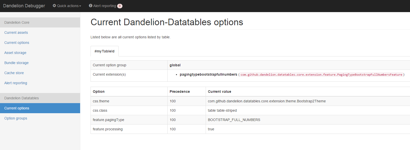
12.2. Option groups
In this page, you can view all options groups computed by Dandelion-Datatables. All these group are computed from the configuration file.
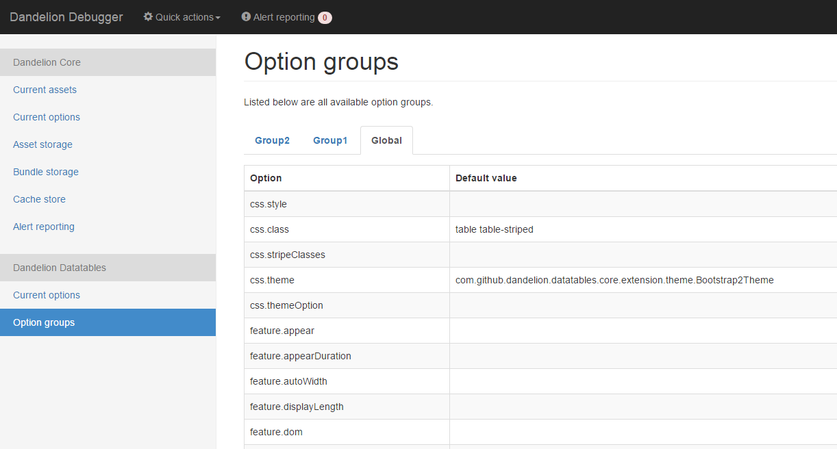
13. Extending Dandelion-Datatables
13.1. Introducing the extension mechanism
Since the earliest version of Dandelion-Datatables, we’ve been trying to develop the component in a modular manner. That’s why if you dig into the source code, you’ll see lots of already existing extensions as the AjaxFeature, the ServerSideFeature, or the Bootstrap2Theme, …
Starting from the v0.9.0, you can now write your own extensions, thus providing a powerful mechanism to customize your tables.
13.1.1. What is an extension?
Any extension will generally fall into one of three categories:
-
Theme: extension used to theme a table (e.g.
Bootstrap2Theme) -
Plugin: extension used to encapsulate a DataTables' native plugin (e.g.
ScrollerPlugin) -
Feature: all other extensions (e.g.
ServerSideFeature)
But generally speaking, we’ll call it simply extension.
13.1.2. What can I do with an extension?
13.1.2.1. Access the DataTables' parameters
One of the key features of Dandelion-Datatables is that it generates all the needed DataTables parameters for you, depending on how you used the JSP taglib or the Thymeleaf dialect.
By using the extension mechanism, you can easily modify these parameters:
-
by adding or replacing any of them
-
by adding a DataTable callback
-
by chaining another Javascript call
13.1.2.2. Access the Dandelion bundles
Often the extension needs some extra Javascript code, e.g. a library.
The concept of asset bundle introduced in the v0.10.0 is also accessible from any extension. Thus, you can benefit from the powerful asset system of Dandelion and play with bundles inside your extension.
13.1.2.3. Access the whole generated Javascript file
Any Javascript code can be inserted in the generated Javascript file. Useful if you need for example to set a variable before the DataTables initialization.
13.1.2.4. Access the HTML table
The HTML table can be easily accessed, as well as the columns and all other nested tags.
To summarize, you have here a powerful mechanism in situations where all ready-to-use extensions don’t fit your needs.
To go further, see how to write your own extension in the next section.
13.2. Writing your own extension
Writing you own extension is quite easy. Just follow these steps:
-
Step 1: create a class that extends
com.github.dandelion.datatables.core.extension.AbstractExtension:package com.example; import com.github.dandelion.datatables.core.extension.AbstractExtension; import com.github.dandelion.datatables.core.html.HtmlTable; public class MyCustomExtension extends AbstractExtension { public String getName() { return "myAwesomeExtension"; (1) } public void setup(HtmlTable table) { (2) // load some bundles... // modify the TableConfiguration... // add, remove, update any DataTable parameter... } }1 The name is important here. It will be used later to activate the extension. 2 The HtmlTableinstance is made available here, thus providing access to both the table structure (HTML) and its configuration through theTableConfigurationinstance. -
Step 2 : in the
META-INF/servicesfolder of your project, create a text file (UTF-8 encoded) using the following convention:
project-root
|__ src
|__ main
|__ resources
|__ META-INF
|__ services
|__ com.github.dandelion.datatables.core.extension.ExtensionInside this file, just add the fully qualified name of your extension.
com.example.MyCustomExtension
Dandelion-Datatables will then load your custom extension thanks to the Service Loader mechanism, as any other ones provided by the component.
13.3. Activating your own extension
Once the extension and the com.github.dandelion.datatables.core.extension.Extension file created, the extension will be detected by the component, but it still needs to be activated in one or more tables.
As for the majority of configuration options, there are several ways to activate your extension.
13.3.1. Globally
Globally implicitly means using global options, i.e. you can activate the extension in all tables of your web application.
That is what the main.extension.names option is for.
global.main.extension.names=myAwesomeExtension (1)| 1 | Note that the main.extension.names option is prefixed by the global group, thus activating the extension globally. Also note that myAwesomeExtension if the name of the extension previously set in the getName() method of the extension. |
| You can of course reduce the scope of application by using a custom option group instead of the global one. |
13.3.2. Locally
Locally implicitly means either using the JSP taglib or the Thymeleaf dialect, i.e. in a single table.
Using JSP
Use the ext table attribute and set one or more extension names separated by a comma.
<datatables:table ... ext="myAwesomeExtension"> (1)
...
</datatables:table>| 1 | myAwesomeExtension if the name of the extension previously set in the getName() method of the extension |
Using Thymeleaf
Use the dt:ext in the same way as for JSP.
<table ... dt:ext="myAwesomeExtension"> (1)
...
</table>| 1 | myAwesomeExtension if the name of the extension previously set in the getName() method of the extension |
And that’s all! Your extension(s) will be loaded as any other built-in extension before the table is displayed.
14. Connections with Dandelion-Core
14.1. Standalone mode
Dandelion-Datatables has been designed to work together with Dandelion-Core, in particular its bundle mechanism. As soon as a feature is enabled (e.g. server-side processing or even a theme), all required bundles are included in the request to make this feature work.
For some reasons, you may wish to use your own vendor libraries. In this case, you can use Dandelion-Datatables in standalone mode. In standalone mode, all vendor bundles of the component are not scanned, freeing you use your own ones.
In order to use a component in a standalone mode, you need to inform Dandelion by using the components.standalone option of Dandelion-Core. Just specify in this option all components you wish to use standalone, by using their component identifier.
components.standalone = ddl-dt (1)| 1 | ddl-dt is the component identifier of Dandelion-Datatables |
Of course, you may need some features that pull in asset bundles. In such a case, Dandelion-Core will inform you that one (or more) bundle(s) are required via the alert reporting tool.
14.2. Adapting vendor bundles
In case you wish to use most of the vendor bundles but just change a few of them, it would be too cumbersome to use the component standalone. Dandelion-Core ships other mechanisms that may fit your needs.
14.2.1. Adapting asset locations
In case you need to change location, you can adapt the internal asset locations resolution strategy by using the corresponding configuration option:
asset.locations.resolution.strategy = webapp,webjar,classpath,jar,remoteNote that almost all vendor bundles are configured with two kind of locations: an internal one (either via the webapp, webjar, classpath or jar location keys) and an external one (via the remote location key).
For example, if you wish to prioritize external locations, just change the above option as follows:
asset.locations.resolution.strategy = remote,webapp,webjar,classpath,jar14.2.2. Adapting asset versions
If you need to use particular version for a vendor asset, you will have to override the asset definition. In order to override an asset, you need to declare another bundle, and use the exact same asset name and type. This way, the asset previously stored in the bundle storage will be replaced by yours.
For example, if you need an ealier version of yadcf than the one packaged in the datatables-core JAR, write the following bundle:
{
"assets" : [
{
"name" : "jquery.datatables.yadcf", (1)
"locations" : {
"webapp" : "/assets/js/vendor/yadcf.js" (2) (3)
}
}
]
}| 1 | The asset name here must be the same than the one computed by Dandelion. Basically, Dandelion just extracts the characters before the file extension but this can be verified using the live debugger |
| 2 | The asset type is not explicitely declared but deducted from the file name declared in the first location found |
| 3 | The location refers here to a custom asset called yadcf.js, stored in the webapp |
14.3. Bundle special syntax
Some attributes from the JSP taglib or the Thymeleaf dialect accept a bundle special syntax. This syntax allow to include one or more bundles in the request, easing interactions with the existing bundles.
attribute="bundleName#javaScriptObject"-
bundleNameis the name of the asset bundle to include in the current request -
javaScriptObjectis a JavaScript object: a function, an array, or any other Javascript object depending on the attribute
You can also specify multiple bundles, separated by a comma:
attribute="bundle1,bundle2#javaScriptObject"| Actually you could have achieved the same goal by using the Dandelion-Core JSP taglib or Thymeleaf dialect. But this syntax is finally a convenient shortcut, preventing you from declaring another JSP taglib / Thymeleaf dialect. |
Appendix A: JSP taglib reference
A.1. <datatables:table> tag
The <datatables:table> tag allows you to display a HTML table thanks to a set of attributes and nested <datatables:column> tags.
Usage
You can either use a "DOM" source, i.e. any Object with an iterator() method or an "AJAX" source, i.e. using a web service that returns data formatted in JSON.
<datatables:table id="myTableId" data="${myCollection}">
<datatables:column title="id" property="id" />
<datatables:column title="firstName" property="firstName" />
<datatables:column title="LastName" property="lastName" />
<datatables:column title="City" property="address.town.name" />
<datatables:column title="Mail" property="mail" />
</datatables:table>Note that:
-
you can also use dynamic attributes, i.e. attributes that are not officially declared in the TagLib Descriptor. This is convenient especially for all native HTML attributes.
<datatables:table cellspacing="5">
...
</datatables:table>-
you can use expression language (EL) in all attributes.
<datatables:table info="${...}">
...
</datatables:table>Reference
Note that all options are presented in the following format:
Attribute name |
Description of the attribute Option: with which name you can refer to the corresponding feature in the configuration file or n/a otherwise |
|
Values |
All possible values |
|
Default |
The default value |
|
Data source |
With which data source type the attribute is compatible |
|
Option |
With which name you can refer to the corresponding feature in the configuration file or n/a otherwise |
|
DOM id of the |
||
Values |
Any Java object with an |
|
Default |
||
Data source |
DOM/AJAX |
|
Option |
n/a |
|
Java object used to populate the table (Either data or url attribute is required) |
||
Values |
Any Java object with an |
|
Default |
||
Data source |
DOM |
|
Option |
n/a |
|
URL called by DataTables to populate the table. Data returned must be in the JSON format (Either data or url attribute is required) |
||
Values |
Any valid URL |
|
Default |
||
Data source |
AJAX |
|
Option |
n/a |
|
Allows you pass extra AJAX params to the request made agains the server |
||
Values |
Any String representing the name of an accessible Javascript function. Bundle special syntax allowed. |
|
Default |
||
Data source |
AJAX |
|
Option |
n/a |
|
Display mode used when the table has finished loading and must appear in the page. A duration can be set (in milliseconds) if the display mode is set to |
||
Values |
block | fadein[,duration] |
|
Default |
fadein |
|
Data source |
DOM/AJAX |
|
Option |
||
Enable or disable automatic column width calculation |
||
Values |
true | false |
|
Default |
true |
|
Data source |
DOM/AJAX |
|
Option |
||
Name of the configuration group to activate in the current table |
||
Values |
||
Default |
||
Data source |
DOM/AJAX |
|
Option |
n/a |
|
CSS style to be applied on the |
||
Values |
||
Default |
||
Data source |
DOM/AJAX |
|
Option |
||
CSS class(es) to be applied on the |
||
Values |
||
Default |
||
Data source |
DOM/AJAX |
|
Option |
||
Comma-separated list of CSS classes that should be applied to displayed rows. This sequence of CSS classes may be of any length, and DataTables will apply each class sequentially, looping when required |
||
Values |
||
Default |
||
Data source |
DOM/AJAX |
|
Option |
||
Defer the creation of the table elements for each row until they are needed for a draw |
||
Values |
true | false |
|
Default |
false |
|
Data source |
AJAX |
|
Option |
||
Number of rows to display on a single page when using pagination |
||
Values |
||
Default |
10 |
|
Data source |
DOM/AJAX |
|
Option |
||
Allows you to specify exactly where in the DOM you want DataTables to inject the various controls it adds to the page |
||
Values |
See DOM positioning |
|
Default |
lfrtip |
|
Data source |
DOM/AJAX |
|
Option |
||
Whether XML characters should be escaped or not |
||
Values |
true | false |
|
Default |
true |
|
Data source |
DOM/AJAX |
|
Option |
n/a |
|
Comma-separated list of enabled export formats. Some formats use reserved words, such as |
||
Values |
||
Default |
||
Data source |
DOM/AJAX |
|
Option |
||
CSS style to be applied to the container used for export links |
||
Values |
||
Default |
||
Data source |
DOM/AJAX |
|
Option |
||
CSS class(es) to be applied to the container used for export links |
||
Values |
||
Default |
||
Data source |
DOM/AJAX |
|
Option |
||
Comma-separated names of extensions to register in the current table |
||
Values |
||
Default |
||
Data source |
DOM/AJAX |
|
Option |
||
Enable or disable global filtering of data |
||
Values |
true | false |
|
Default |
true |
|
Data source |
DOM/AJAX |
|
Option |
||
jQuery selector targeting the element on which a 'click' event will be bound to trigger the clearing of all filter elements |
||
Values |
Any jQuery selector |
|
Default |
||
Data source |
DOM/AJAX |
|
Option |
||
Delay (in milliseconds) to be used before the AJAX call is performed to obtain data |
||
Values |
Any integer |
|
Default |
500ms |
|
Data source |
DOM/AJAX |
|
Option |
||
Placeholder used to hold the individual column filtering elements |
||
Values |
header | footer | none |
|
Default |
footer |
|
Data source |
DOM/AJAX |
|
Option |
||
jQuery selector targeting the element on which a 'click' event will be bound to trigger the filtering |
||
Values |
Any jQuery selector |
|
Default |
||
Data source |
DOM/AJAX |
|
Option |
||
Enable or disable the table information display. This shows information about the data that is currently visible on the page, including information about filtered data if that action is being performed |
||
Values |
true | false |
|
Default |
true |
|
Data source |
DOM/AJAX |
|
Option |
||
Respectively fix the header, footer, left column, right column |
||
Values |
top | bottom | left | right |
|
Default |
top |
|
Data source |
DOM/AJAX |
|
Option |
||
Enable jQuery UI ThemeRoller support |
||
Values |
true | false |
|
Default |
false |
|
Data source |
DOM/AJAX |
|
Option |
||
If |
||
Values |
true | false |
|
Default |
true |
|
Data source |
DOM/AJAX |
|
Option |
||
Specify the entries in the length drop down menu that DataTables show when pagination is enabled |
||
Values |
||
Default |
10,25,50,100 |
|
Data source |
DOM/AJAX |
|
Option |
||
(<a href="/datatables/features/plugins/fixedheader.html">fixedHeader</a>) Offset applied on the top |
||
Values |
||
Default |
||
Data source |
DOM/AJAX |
|
Option |
||
Enable or disable pagination |
||
Values |
true | false |
|
Default |
true |
|
Data source |
DOM/AJAX |
|
Option |
||
Name of the pagination interaction methods which present different page controls to the end user |
||
Values |
simple | simple_numbers | full | full_numbers | input | listbox | scrolling | extStyle | bootstrap_simple | bootstrap_full | bootstrap_full_numbers |
|
Default |
simple |
|
Data source |
DOM/AJAX |
|
Option |
||
Enable pipelining data for paging when server-side processing is enabled |
||
Values |
true | false |
|
Default |
false |
|
Data source |
AJAX |
|
Option |
||
Pipe size used when pipelining is enabled, i.e. times that the user can page before a request must be made of the server |
||
Values |
Any integer starting from 1 |
|
Default |
5 |
|
Data source |
AJAX |
|
Option |
||
Enable or disable the display of a 'processing' indicator when the table is being processed (e.g. a sort). This is particularly useful for tables with large amounts of data where it can take a noticeable amount of time to sort the entries |
||
Values |
true | false |
|
Default |
true |
|
Data source |
DOM/AJAX |
|
Option |
||
Name of a Javascript function that will be called in the 'click' event bound by the reloadSelector attribute. Note that when using this attribute, you will have to call manually the |
||
Values |
Any String representing the name of an accessible Javascript function. Bundle special syntax allowed. |
|
Default |
Empty string |
|
Data source |
AJAX |
|
Option |
||
jQuery selector targeting the element on which a 'click' event will be bound to trigger the table reloading |
||
Values |
Any jQuery selector |
|
Default |
Empty string |
|
Data source |
AJAX |
|
Option |
||
Name under which the object representing the current row is added to the pageContext, allowing you to access the object in the body of a |
||
Values |
||
Default |
||
Data source |
DOM |
|
Option |
||
Evaluated as a property of the bean being iterated on. The result will be used to apply an ID on each row |
||
Values |
||
Default |
||
Data source |
DOM |
|
Option |
||
Prefix used to build an ID that will be applied on all table rows. If |
||
Values |
||
Default |
||
Data source |
DOM |
|
Option |
||
Suffix used to build an ID that will be applied on all table rows. If |
||
Values |
||
Default |
||
Data source |
DOM |
|
Option |
||
When vertical (y) scrolling is enabled, DataTables will force the height of the table’s viewport to the given height at all times (useful for layout). However, this can look odd when filtering data down to a small data set, and the footer is left "floating" further down. This parameter (when enabled) will cause DataTables to collapse the table’s viewport down when the result set will fit within the given Y height. |
||
Values |
true | false |
|
Default |
false |
|
Data source |
DOM/AJAX |
|
Option |
||
Enable horizontal scrolling. When a table is too wide to fit into a certain layout, or you have a large number of columns in the table, you can enable x-scrolling to show the table in a viewport, which can be scrolled |
||
Values |
Any CSS unit, or a number (in which case it will be treated as a pixel measurement) |
|
Default |
Empty string, i.e. disabled |
|
Data source |
DOM/AJAX |
|
Option |
||
Use more width than it might otherwise do when x-scrolling is enabled |
||
Values |
Any CSS unit, or a number (in which case it will be treated as a pixel measurement) |
|
Default |
||
Data source |
DOM/AJAX |
|
Option |
||
Enable vertical scrolling. Vertical scrolling will constrain the DataTable to the given height, and enable scrolling for any data which overflows the current viewport. This can be used as an alternative to paging to display a lot of data in a small area (although paging and scrolling can both be enabled at the same time) |
||
Values |
Any CSS unit, or a number (in which case it will be treated as a pixel measurement) |
|
Default |
Empty string, i.e. disabled |
|
Data source |
DOM/AJAX |
|
Option |
||
Configure DataTables to use server-side processing. Note that the |
||
Values |
true | false |
|
Default |
false |
|
Data source |
AJAX |
|
Option |
||
Enable or disable sorting of columns. Sorting of individual columns can be disabled by the |
||
Values |
true | false |
|
Default |
true |
|
Data source |
DOM/AJAX |
|
Option |
||
When enabled a cookie will be used to save table display information such as pagination information, display length, filtering and sorting. As such when the end user reloads the page the display display will match what thy had previously set up |
||
Values |
true | false |
|
Default |
false |
|
Data source |
DOM/AJAX |
|
Option |
||
Name of a theme to activate for the current table |
||
Values |
bootstrap2 | bootstrap3 | jqueryui |
|
Default |
||
Data source |
DOM/AJAX |
|
Option |
||
Name of an option to activate in relation to the current activated theme |
||
Values |
||
Default |
||
Data source |
DOM/AJAX |
|
Option |
||
A.2. <datatables:column> tag
The <datatables:column> tag allows you to define the content of a column.
Usage
The <datatables:column> tag must be nested within a <datatables:table> tag.
You can either let the property attribute handle the content of a cell. This attribute allows to access to a bean’s property.
<datatables:table id="myTableId" data="${myCollection}" ...>
<datatables:column property="aPropertyOfTheBean" ... />
</datatables:table>Or you can set a body and put anything you want inside (HTML code, JSTL tags, Spring tags, …). See the row table attribute which can be particularly useful in this case (compatible with DOM source only)
<datatables:table id="myTableId" data="${myCollection}" row="aStringRepresentingTheBean" ...>
<datatables:column ...>
<span color="red;">
<c:out value="${aStringRepresentingTheBean.aPropertyOfTheBean}" />
</span>
</datatables:column>
</datatables:table>Reference
CSS style to be applied on the header cell of the column ( |
||
Values |
||
Default |
||
Data source |
DOM/AJAX |
|
CSS style to be applied on all column cells ( |
||
Values |
||
Default |
||
Data source |
DOM |
|
CSS class(es) to be applied on the header cell of the column ( |
||
Values |
||
Default |
||
Data source |
DOM/AJAX |
|
CSS class(es) to be applied on all column cells ( |
||
Values |
||
Default |
||
Data source |
DOM/AJAX |
|
Default string to be used if the value returned from the |
||
Values |
||
Default |
Empty string |
|
Data source |
DOM/AJAX |
|
Comma-separated list of strings used to filter in which view(s) the column content will be displayed. Not that some strings are reserved: * 'all': the content will appear both client-side and is all export formats * 'csv': the content will appear only in the csv export * 'xls': the content will appear only in the xls export * 'xlsx': the content will appear only in the xlsx export * 'pdf': the content will appear only in the pdf export * 'xml': the content will appear only in the xml export |
||
Values |
All (HTML and in all export formats) |
|
Default |
||
Data source |
DOM/AJAX |
|
Whether XML characters should be escaped or not |
||
Values |
true | false |
|
Default |
true |
|
Data source |
DOM/AJAX |
|
Enable or disable filtering in the column. By default, an input field will be created in the tfoot section of the table |
||
Values |
true | false |
|
Default |
false |
|
Data source |
DOM/AJAX |
|
If the column is filterable, configures the filter type |
||
Values |
select | input |
|
Default |
input |
|
Data source |
DOM/AJAX |
|
Name of a Javascript variable containing data used to populate the filtering select |
||
Values |
Either an array of values or an array of objects |
|
Default |
||
Data source |
DOM/AJAX |
|
MessageFormat pattern that will be used to format the value passed in the |
||
Values |
Any valid pattern |
|
Default |
||
Data source |
DOM |
|
DOM id to be given to the header cell ( |
||
Values |
||
Default |
||
Data source |
DOM/AJAX |
|
When using a DOM source, this is the name of the object’s attribute of the collection being iterated on. When using an AJAX source, this is the name of the JSON property to be read from the data obtained by the AJAX call |
||
Values |
||
Default |
||
Data source |
DOM/AJAX |
|
Name of a JavasScript function that will be called to render the column when using an AJAX source |
||
Values |
Any String representing the name of an accessible Javascript function. Bundle special syntax allowed |
|
Default |
||
Data source |
AJAX |
|
Enable or disable searching in the column. If false, the column won’t be filtered by the global search field |
||
Values |
true | false |
|
Default |
true |
|
Data source |
DOM/AJAX |
|
jQuery selector targeting any element that will be populated with a filtering element (depending on the |
||
Values |
Any jQuery selector |
|
Default |
Empty string |
|
Data source |
DOM/AJAX |
|
Enable or disable sorting on column |
||
Values |
true | false |
|
Default |
true |
|
Data source |
DOM/AJAX |
|
Comma-separated list of directions to be used to control the sorting sequence |
||
Values |
Comma-separated list of |
|
Default |
||
Data source |
DOM/AJAX |
|
If the column is sortable, sets the default sorting direction |
||
Values |
asc | desc |
|
Default |
asc |
|
Data source |
DOM/AJAX |
|
If the column is sortable, sets the order in which the sort should be initialized |
||
Values |
Any column index (starting from 0) |
|
Default |
||
Data source |
DOM/AJAX |
|
If the column is sortable, configures the type of sort to apply to the column |
||
Values |
alt_string | anti_the | chinese_string | date_de | date_eu | date_euro | date_uk | filesize | ip_address | natural | persian | scientific | signed_num | turkish_string |
|
Default |
Type-based, internally guessed by DataTables |
|
Data source |
DOM/AJAX |
|
Title to be given to the column ( |
||
Values |
||
Default |
||
Data source |
DOM/AJAX |
|
Resource key used to lookup the title value in the configured resource bundle |
||
Value |
||
Default |
||
Data source |
DOM/AJAX |
|
Enable or disable the display of the column. Note that even if the column is not visible, it is searchable |
||
Values |
true | false |
|
Default |
true |
|
Data source |
DOM/AJAX |
|
A.3. <datatables:columnHead> tag
The <datatables:columnHead> tag allows you to fill in a column header with a more complex content than a simple string.
Usage
The <datatables:columnHead> tag must be nested within a <datatables:column> tag.
<datatables:table id="myTableId" data="${myCollection}" ...>
<datatables:column>
<datatables:columnHead>
<!-- Any content here will appear in the column header... -->
</datatables:columnHead>
<!-- Any content here will appear in each cell -->
</datatables:column>
</datatables:table>Reference
This tag has no attribute.
A.4. <datatables:option> tag
The <datatables:option> tag allows you to set a configuration option in the enclosing table.
Usage
The <datatables:option> tag must be nested within a <datatables:column> tag.
<datatables:table id="myTableId" data="${myCollection}">
...
<datatables:option name="feature.dom" value="t" />
...
</datatables:table>Name of the configuration option to be set locally |
||
Data source |
DOM/AJAX |
|
Value of the configuration option to be set locally |
||
Data source |
DOM/AJAX |
|
A.5. <datatables:export> tag
Configures a type of export, e.g. allowing to apply CSS on export links.
Usage
The <datatables:export> tag must be nested within a <datatables:table> tag.
<datatables:table ... export="pdf,xls"> (1)
...
<datatables:export type="pdf" cssClass="btn btn-info" />
<datatables:export type="xls" cssClass="btn btn-success" />
...
</datatables:table>| 1 | Note that an export must be enabled using the export table attribute before being able to configure it |
Reference
Name of the configuration option to be set locally |
||
Values |
Any valid option name |
|
Default |
||
Data source |
DOM/AJAX |
|
Type of export to configure (Required) |
||
Values |
Must match one of the value set in the |
|
Default |
||
Data source |
DOM/AJAX |
|
Label to be applied to the export link |
||
Values |
Any string |
|
Default |
The upper-cased value of the |
|
Data source |
DOM/AJAX |
|
CSS style to be applied to the export link. (HTML pass through attribute) |
||
Values |
One or more CSS properties and values separated by semicolons |
|
Default |
||
Data source |
DOM/AJAX |
|
CSS class(es) to be applied to the export link. (HTML pass through attribute) |
||
Values |
||
Default |
||
Data source |
DOM/AJAX |
|
Whether header cells ( |
||
Values |
true | false |
|
Default |
true |
|
Data source |
DOM/AJAX |
|
Name to be given to the exported file (without extension) |
||
Values |
Any string |
|
Default |
[exportType-upperCased]-[yyyymmDD] |
|
Data source |
DOM/AJAX |
|
File extension of the exported file. Note that if reserved words are used, the file extension will be automatically set |
||
Values |
Any string |
|
Default |
The lower-cased value of the |
|
Data source |
DOM/AJAX |
|
Whether columns should be autosized in the export file |
||
Values |
true | false |
|
Default |
true |
|
Data source |
DOM/AJAX |
|
URL to be used for exporting. Handy if you want to customize exports using controllers. When no |
||
Values |
true | false |
|
Default |
true |
|
Data source |
DOM/AJAX |
|
HTTP method to be used when performing the export call when the |
||
Values |
Any valid HTTP method |
|
Default |
GET |
|
Data source |
DOM/AJAX |
|
Orientation of the export file (PDF only) |
||
Values |
landscape | portrait |
|
Default |
landscape |
|
Data source |
DOM/AJAX |
|
Mime type applied to the response when downloading the export file. Note that if one of the reserved words is used, the mime type will be automatically set |
||
Values |
||
Default |
||
Data source |
DOM/AJAX |
|
Whether XML characters should be escaped or not |
||
Values |
true | false |
|
Default |
true |
|
Data source |
DOM/AJAX |
|
A.6. <datatables:callback> tag
The <datatables:callback> tag allows you to configure one or multiple DataTables callbacks in the table.
Usage
The <datatables:callback> tag must be nested within a <datatables:table> tag.
<datatables:table>
...
<datatables:callback type="..." function="..." />
...
</datatables:table>See the callback section for more details.
Reference
Type of the callback (Required) |
||
Values |
createdrow | draw | footer | format | header | info | init | predraw | row | statesave | statesaveparams | stateload | stateloadparams | stateloaded |
|
Default |
||
Data source |
DOM/AJAX |
|
Name of a JavaScript function that will be called inside the configured callback (Required) |
||
Values |
Any String representing the name of an accessible JavaScript function. Bundle special syntax allowed. |
|
Default |
||
Data source |
DOM/AJAX |
|
A.7. <datatables:extraJs> tag
Specify the location of an extra file containing JavaScript code which will be merged with the main JavaScript generated file.
Usage
The <datatables:extraJs> tag must be nested within a <datatables:table> tag.
<datatables:table>
...
<datatables:extraJs bundles="bundle1" />
...
</datatables:table>See the extra JavaScript section for more details.
Reference
Comma-separated list of bundle to include in the current request (Required) |
||
Values |
||
Default |
||
Data source |
DOM/AJAX |
|
Location where extra file content will be inserted into the generated configuration |
||
Values |
beforeall | beforestartdocumentready | afterstartdocumentready | beforeenddocumentready | afterall |
|
Default |
BEFOREALL |
|
Data source |
DOM/AJAX |
|
A.8. <datatables:extraHtml> tag
The <datatables:extraHtml> tag allows you to create a HTML snippet that will be used as a DataTables feature plug-in.
Once created, the snippet must be activated thanks to dom table attribute.
Usage
The <datatables:extraHtml> tag must be nested within a <datatables:table> tag.
<datatables:table id="myTableId" data="${persons}" dom="l0frtip">
...
<datatables:extraHtml uid="0" cssStyle="float:right; margin-left: 5px;">
<a class="btn" onclick="alert('Click!');">My custom link</a>
</datatables:extraHtml>
...
</datatables:table>See the extra HTML snippets section for more information.
Reference
The identifying character to be assigned to the HTML snippet. Once the HTML snippet created, it must be activated thanks to the |
||
Values |
Any figure between 0 and 9 is recommended |
|
Default |
||
Data source |
DOM/AJAX |
|
CSS style to be applied to the container of the extra HTML snippet |
||
Values |
||
Default |
||
Data source |
DOM/AJAX |
|
CSS class(es) to be applied to the container of the extra HTML snippet |
||
Values |
||
Default |
||
Data source |
DOM/AJAX |
|
Container used to wrap the extra HTML snippet |
||
Values |
Any valid HTML element |
|
Default |
div |
|
Data source |
DOM/AJAX |
|
Whether XML characters should be escaped or not |
||
Values |
true | false |
|
Default |
true |
|
Data source |
DOM/AJAX |
|
Appendix B: Thymeleaf dialect reference
B.1. <table> attributes
Usage
You can either use a "DOM" source, i.e. any Object with an iterator() method or an "AJAX" source, i.e. using a web service that returns data formatted in JSON.
<table id="myTableId" dt:table="true"> (1)
<thead>
<tr>
<th>Id</th>
<th>LastName</th>
<th>FirstName</th>
<th>City</th>
<th>Mail</th>
</tr>
</thead>
<tbody>
<tr th:each="person : ${persons}">
<td th:text="${person?.id}">1</td>
<td th:text="${person?.lastName}">Doe</td>
<td th:text="${person?.firstName}">John</td>
<td th:text="${person?.address?.town?.name}">Nobody knows!</td>
<td th:text="${person?.mail}">john@doe.com</td>
</tr>
</tbody>
</table>| 1 | Both id and dt:table attributes are required |
<table id="myTableId" dt:table="true" dt:url="@{/persons}">
<thead>
<tr>
<th dt:property="id">Id</th>
<th dt:property="firstName">Firstname</th>
<th dt:property="lastName">Lastname</th>
<th dt:property="address.town.name">City</th>
<th dt:property="mail">Mail</th>
</tr>
</thead>
</table>Reference
Note that all options are presented in the following format:
Enable or disable the Dandelion-Datatables dialect (Required) |
||
Values |
true | false |
|
Default |
||
Data source |
DOM/AJAX |
|
Option |
n/a |
|
Allows you pass extra AJAX params to the request made agains the server |
||
Values |
Any String representing the name of an accessible Javascript function. Bundle special syntax allowed. |
|
Default |
||
Data source |
AJAX |
|
Option |
n/a |
|
Display mode used when the table has finished loading and must appear in the page. A duration can be set (in milliseconds) if the display mode is set to |
||
Values |
block | fadein[,duration] |
|
Default |
fadein |
|
Data source |
DOM/AJAX |
|
Option |
||
Enable or disable automatic column width calculation |
||
Values |
true | false |
|
Default |
true |
|
Data source |
DOM/AJAX |
|
Option |
||
Name of the configuration group to activate for the current table |
||
Values |
||
Default |
||
Data source |
DOM/AJAX |
|
Option |
n/a |
|
Defer the creation of the table elements for each row until they are needed for a draw |
||
Values |
true | false |
|
Default |
false |
|
Data source |
AJAX |
|
Option |
||
Number of rows to display on a single page when using pagination |
||
Values |
||
Default |
10 |
|
Data source |
DOM/AJAX |
|
Option |
||
Allows you to specify exactly where in the DOM you want DataTables to inject the various controls it adds to the page |
||
Values |
See DOM positioning |
|
Default |
lfrtip |
|
Data source |
DOM/AJAX |
|
Option |
||
Comma-separated list of enabled export formats. Some formats use reserved words, such as |
||
Values |
||
Default |
||
Data source |
DOM/AJAX |
|
Option |
||
CSS style to be applied to the container used for export links |
||
Values |
||
Default |
||
Data source |
DOM/AJAX |
|
Option |
||
CSS class(es) to be applied to the container used for export links |
||
Values |
||
Default |
||
Data source |
DOM/AJAX |
|
Option |
||
Comma-separated names of extensions to register in the current table |
||
Values |
||
Default |
||
Data source |
DOM/AJAX |
|
Option |
||
Enable or disable global filtering of data |
||
Values |
true | false |
|
Default |
true |
|
Data source |
DOM/AJAX |
|
Option |
||
jQuery selector targeting the element on which a 'click' event will be bound to trigger the clearing of all filter elements |
||
Values |
Any jQuery selector |
|
Default |
||
Data source |
DOM/AJAX |
|
Option |
||
Delay (in milliseconds) to be used before the AJAX call is performed to obtain data |
||
Values |
An integer |
|
Default |
500ms |
|
Data source |
DOM/AJAX |
|
Option |
||
Placeholder used to hold the individual column filtering elements |
||
Values |
header | footer | none |
|
Default |
footer |
|
Data source |
DOM/AJAX |
|
Option |
||
jQuery selector targeting the element on which a 'click' event will be bound to trigger the filtering |
||
Values |
||
Default |
||
Data source |
DOM/AJAX |
|
Option |
||
Enable or disable the table information display. This shows information about the data that is currently visible on the page, including information about filtered data if that action is being performed |
||
Values |
true | false |
|
Default |
true |
|
Data source |
DOM/AJAX |
|
Option |
||
Enable jQuery UI ThemeRoller support |
||
Values |
true | false |
|
Default |
false |
|
Data source |
DOM/AJAX |
|
Option |
||
If |
||
Values |
true | false |
|
Default |
true |
|
Data source |
DOM/AJAX |
|
Option |
||
Specify the entries in the length drop down menu that DataTables show when pagination is enabled |
||
Values |
||
Default |
10,25,50,100 |
|
Data source |
DOM/AJAX |
|
Option |
||
Enable or disable pagination |
||
Values |
true | false |
|
Default |
true |
|
Data source |
DOM/AJAX |
|
Option |
||
Name of the pagination interaction methods which present different page controls to the end user |
||
Values |
simple | simple_numbers | full | full_numbers | input | listbox | scrolling | extStyle | bootstrap_simple | bootstrap_full | bootstrap_full_numbers |
|
Default |
simple |
|
Data source |
DOM/AJAX |
|
Option |
||
Enable pipelining data for paging when server-side processing is enabled |
||
Values |
true | false |
|
Default |
false |
|
Data source |
AJAX |
|
Option |
||
Pipe size used when pipelining is enabled, i.e. times that the user can page before a request must be made of the server |
||
Values |
Any integer starting from 1 |
|
Default |
5 |
|
Data source |
AJAX |
|
Option |
||
Enable or disable the display of a 'processing' indicator when the table is being processed (e.g. a sort). This is particularly useful for tables with large amounts of data where it can take a noticeable amount of time to sort the entries |
||
Values |
true | false |
|
Default |
true |
|
Data source |
DOM/AJAX |
|
Option |
||
Name of a Javascript function that will be called in the 'click' event bound by the reloadSelector attribute. Note that when using this attribute, you will have to call manually the |
||
Values |
Any String representing the name of an accessible Javascript function. Bundle special syntax allowed. |
|
Default |
Empty string |
|
Data source |
AJAX |
|
Option |
||
jQuery selector targeting the element on which a 'click' event will be bound to trigger the table reloading |
||
Values |
Any jQuery selector |
|
Default |
Empty string |
|
Data source |
AJAX |
|
Option |
||
When vertical (y) scrolling is enabled, DataTables will force the height of the table’s viewport to the given height at all times (useful for layout). However, this can look odd when filtering data down to a small data set, and the footer is left "floating" further down. This parameter (when enabled) will cause DataTables to collapse the table’s viewport down when the result set will fit within the given Y height |
||
Values |
true | false |
|
Default |
false |
|
Data source |
DOM/AJAX |
|
Option |
||
Enable horizontal scrolling. When a table is too wide to fit into a certain layout, or you have a large number of columns in the table, you can enable x-scrolling to show the table in a viewport, which can be scrolled |
||
Values |
Any CSS unit, or a number (in which case it will be treated as a pixel measurement) |
|
Default |
Empty string, i.e. disabled |
|
Data source |
DOM/AJAX |
|
Option |
||
Use more width than it might otherwise do when x-scrolling is enabled |
||
Values |
Any CSS unit, or a number (in which case it will be treated as a pixel measurement) |
|
Default |
||
Data source |
DOM/AJAX |
|
Option |
||
Enable vertical scrolling. Vertical scrolling will constrain the DataTable to the given height, and enable scrolling for any data which overflows the current viewport. This can be used as an alternative to paging to display a lot of data in a small area (although paging and scrolling can both be enabled at the same time) |
||
Values |
Any CSS unit, or a number (in which case it will be treated as a pixel measurement) |
|
Default |
Empty string, i.e. disabled |
|
Data source |
DOM/AJAX |
|
Option |
||
Configure DataTables to use server-side processing. Note that the |
||
Values |
true | false |
|
Default |
false |
|
Data source |
AJAX |
|
Option |
||
Enable or disable sorting of columns. Sorting of individual columns can be disabled by the |
||
Values |
true | false |
|
Default |
true |
|
Data source |
DOM/AJAX |
|
Option |
||
When enabled a cookie will be used to save table display information such as pagination information, display length, filtering and sorting. As such when the end user reloads the page the display display will match what thy had previously set up |
||
Values |
true | false |
|
Default |
false |
|
Data source |
DOM/AJAX |
|
Option |
||
Comma-separated list of CSS classes that should be applied to displayed rows. This sequence of CSS classes may be of any length, and DataTables will apply each class sequentially, looping when required |
||
Values |
||
Default |
||
Data source |
DOM/AJAX |
|
Option |
||
Name of a theme to activate for the current table |
||
Values |
bootstrap2 | bootstrap3 | jqueryui |
|
Default |
||
Data source |
DOM/AJAX |
|
Option |
||
Name of an option to activate in relation to the current activated theme |
||
Values |
||
Default |
||
Data source |
DOM/AJAX |
|
Option |
||
URL called by DataTables to populate the table. Data returned must be in the JSON format |
||
Values |
||
Default |
||
Data source |
AJAX |
|
Option |
n/a |
|
B.2. <thead> attributes
Usage
All thead attributes are mainly used to configure plugins.
<table id="myTableId" dt:table="true" dt:ext="fixedheader">
<thead dt:fixedOffsetTop="40">
<tr>
<th>Id</th>
<th>LastName</th>
<th>FirstName</th>
<th>City</th>
<th>Mail</th>
</tr>
</thead>
<tbody>
<tr th:each="person : ${persons}">
<td th:text="${person?.id}">1</td>
<td th:text="${person?.lastName}">Doe</td>
<td th:text="${person?.firstName}">John</td>
<td th:text="${person?.address?.town?.name}">Nobody knows!</td>
<td th:text="${person?.mail}">john@doe.com</td>
</tr>
</tbody>
</table>Reference
Note that all options are presented in the following format:
Offset applied on the top |
||
Values |
||
Default |
||
Data source |
DOM/AJAX |
|
Respectively fix the header, footer, left column, right column |
||
Values |
top | bottom | left | right |
|
Default |
top |
|
Data source |
DOM/AJAX |
|
B.3. <th> attributes
Usage
All <th> attributes allow to configure a column.
<table dt:table="true" ...>
<thead ...>
<tr>
<th>...</th>
<th>...</th>
<th dt:filterable="true">...</th>
<th>...</th>
<th>...</th>
<tr>
</thead>
...
</table>Reference
Note that all options are presented in the following format:
Default string to be used if the value returned from the |
||
Values |
||
Default |
Empty string |
|
Data source |
DOM/AJAX |
|
Enable or disable filtering in the column. By default, an input field will be created in the tfoot section of the table |
||
Values |
true | false |
|
Default |
false |
|
Data source |
DOM/AJAX |
|
If the column is filterable, configures the filter type |
||
Values |
select | input |
|
Default |
input |
|
Data source |
DOM/AJAX |
|
Name of a Javascript variable containing data used to populate the filtering select |
||
Values |
Either an array of values or an array of objects |
|
Default |
||
Data source |
DOM/AJAX |
|
When using a DOM source, this is the name of the object’s attribute of the collection being iterated on. When using an AJAX source, this is the name of the JSON property to be read from the data obtained by the AJAX call |
||
Values |
||
Default |
||
Data source |
DOM/AJAX |
|
Name of a JavasScript function that will be called to render the column when using an AJAX source |
||
Values |
Any String representing the name of an accessible Javascript function. Bundle special syntax allowed |
|
Default |
||
Data source |
AJAX |
|
Enable or disable searching in the column. If false, the column won’t be filtered by the global search field |
||
Values |
true | false |
|
Default |
true |
|
Data source |
DOM/AJAX |
|
jQuery selector targeting any element that will be populated with a filtering element (depending on the |
||
Values |
Any jQuery selector |
|
Default |
Empty string |
|
Data source |
DOM/AJAX |
|
Enable or disable sorting on column |
||
Values |
true | false |
|
Default |
true |
|
Data source |
DOM/AJAX |
|
Comma-separated list of directions to be used to control the sorting sequence |
||
Values |
Comma-separated list of |
|
Default |
||
Data source |
DOM/AJAX |
|
If the column is sortable, sets the default sorting direction |
||
Values |
asc | desc |
|
Default |
asc |
|
Data source |
DOM/AJAX |
|
If the column is sortable, sets the order in which the sort should be initialized |
||
Values |
Any column index (starting from 0) |
|
Default |
||
Data source |
DOM/AJAX |
|
If the column is sortable, configures the type of sort to apply to the column |
||
Values |
alt_string | anti_the | chinese_string | date_de | date_eu | date_euro | date_uk | filesize | ip_address | natural | persian | scientific | signed_num | turkish_string |
|
Default |
Type-based, internally guessed by DataTables |
|
Data source |
DOM/AJAX |
|
Enable or disable the display of the column. Note that even if the column is not visible, it is searchable |
||
Values |
true | false |
|
Default |
true |
|
Data source |
DOM/AJAX |
|
B.4. <td> attributes
All <td> attributes allow to configure the exported columns.
Usage
<table dt:table="true" ...>
...
<tbody>
<tr>
...
<td dt:csv="${bean.mail}">
<a th:href="${'mailto:' + bean.mail}" th:text="${bean.mail}">john@doe.com</a>
</td>
...
</tr>
</tbody>
</table>Reference
Processed Thymeleaf expression that will appear in the CSV export only |
||
Values |
||
Default |
||
Data source |
DOM |
|
Processed Thymeleaf expression that will appear in the PDF export only |
||
Values |
||
Default |
||
Data source |
DOM |
|
Processed Thymeleaf expression that will appear in the XLS export only |
||
Values |
||
Default |
||
Data source |
DOM |
|
Processed Thymeleaf expression that will appear in the XLSX export only |
||
Values |
||
Default |
||
Data source |
DOM |
|
Processed Thymeleaf expression that will appear in the PDF export only |
||
Values |
||
Default |
||
Data source |
DOM |
|
B.5. <div> attributes
The <div> attributes allow to configure several features such as export or callbacks in a particular table. See the configuration div for more information.
Usage
Note that there are some requirements when using a configuration div:
-
A configuration div must locate just above the
<table>tag it is supposed to configure -
In order to link a configuration div to a table, the
dt:confdiv attribute and theidtable attribute must match
<div dt:conf="myTableId">
<div dt:confType="callback" dt:type="info" dt:function="callbacks#infoCallback" /> (1)
</div>
<table id="myTableId" dt:table="true">
...
</table>| 1 | A callback of type info is registered. The function infoCallback will be used as callback, coming from the bundle called callbacks. This bundle is included in the request thanks to the bundle syntax |
Reference
Turns a simple |
||
Values |
The value must match the id of an existing table in the same page |
|
Default |
||
Data source |
DOM/AJAX |
|
Type of feature to configure |
||
Values |
callback | export | option | extrajs | extrahtml |
|
Default |
||
Data source |
DOM/AJAX |
|
Attributes for the |
||
Type of the callback (required) |
||
Values |
createdrow | draw | footer | format | header | info | init | predraw | row | statesave | statesaveparams | stateload | stateloadparams | stateloaded |
|
Default |
||
Data source |
DOM/AJAX |
|
Name of a Javascript function that will be called inside the configured callback (required) |
||
Values |
Any String representing the name of an accessible Javascript function. Bundle special syntax allowed. |
|
Default |
||
Data source |
DOM/AJAX |
|
Attributes for the |
||
Type of export to configure (required) |
||
Values |
The value must match one of the export format configured in the |
|
Default |
||
Data source |
DOM/AJAX |
|
Type of export to configure |
||
Values |
URL to be used for exporting. Handy if you want to customize exports using controllers. When no |
|
Default |
||
Data source |
DOM/AJAX |
|
Label applied to the export link |
||
Values |
||
Default |
The upper-cased value of the |
|
Data source |
DOM/AJAX |
|
CSS style to be applied to the export link |
||
Values |
||
Default |
||
Data source |
DOM/AJAX |
|
CSS class(es) to be applied to the export link |
||
Values |
||
Default |
||
Data source |
DOM/AJAX |
|
Whether header cells ( |
||
Values |
true|false |
|
Default |
true |
|
Data source |
DOM/AJAX |
|
Name to be given to the export file (without extension) |
||
Values |
||
Default |
[exportType-upperCased]-[yyyymmDD] |
|
Data source |
DOM/AJAX |
|
File extension of the export file. Note that if reserved words are used, the file extension will be automatically set |
||
Values |
||
Default |
The lower-cased value of the |
|
Data source |
DOM/AJAX |
|
Whether columns should be autosized in the export file |
||
Values |
true | false |
|
Default |
true |
|
Data source |
DOM/AJAX |
|
HTTP method to be used when performing the export call when the |
||
Values |
Any valid HTTP method |
|
Default |
GET |
|
Data source |
DOM/AJAX |
|
Orientation of the export file (PDF only) |
||
Values |
landscape | portrait |
|
Default |
landscape |
|
Data source |
DOM/AJAX |
|
Mime type applied to the response when downloading the export file. Note that if one of the reserved words is used, the mime type will be automatically set |
||
Values |
||
Default |
||
Data source |
DOM/AJAX |
|
Attributes for the |
||
Name of the property to override (Required) |
||
Values |
||
Default |
||
Data source |
DOM/AJAX |
|
Value of the property to override (Required) |
||
Values |
||
Default |
||
Data source |
DOM/AJAX |
|
Attributes for the |
||
Comma-separated list of bundle to include in the current request (Required) |
||
Values |
||
Default |
||
Data source |
DOM/AJAX |
|
Location where extra file content will be inserted into the generated configuration (Required) |
||
Values |
See the extra JavaScript section for all possible values |
|
Default |
beforeall |
|
Data source |
DOM/AJAX |
|
Attributes for the |
||
The identifying character to be assigned to the HTML snippet. Once the HTML snippet created, it must be activated thanks to the |
||
Values |
Any figure between 0 and 9 is recommended |
|
Default |
||
Data source |
DOM/AJAX |
|
CSS style to be applied to the container of the extra HTML snippet |
||
Values |
||
Default |
||
Data source |
DOM/AJAX |
|
CSS class(es) to be applied to the container of the extra HTML snippet |
||
Values |
||
Default |
||
Data source |
DOM/AJAX |
|
Container used to wrap the extra HTML snippet |
||
Values |
Any valid HTML element |
|
Default |
div |
|
Data source |
DOM/AJAX |
|
Appendix C: Configuration options reference
The table below lists all available configuration options.
Note that all options are presented in the following format:
option.name |
Description of the option |
|
Values |
All possible values |
|
Default |
The default value |
|
Groupable |
Whether the option can be grouped or not |
|
Reference
Main options |
||
Name of extensions you wish to activate globally. See this section for more information. |
||
Values |
Comma-separated list of extension names |
|
Default |
||
Groupable |
Yes |
|
AJAX-related options |
||
Defer the creation of the table elements for each row until they are needed for a draw |
||
Values |
true | false |
|
Default |
false |
|
Groupable |
Yes |
|
Enable pipelining data for paging when server-side processing is enabled |
||
Values |
true | false |
|
Default |
false |
|
Groupable |
Yes |
|
Pipe size used when |
||
Values |
Any integer starting from 1 |
|
Default |
5 |
|
Groupable |
Yes |
|
Configure DataTables to use server-side processing. Note that the url attribute must be given in order to give DataTables a source to obtain the required data for each draw |
||
Values |
true | false |
|
Default |
false |
|
Groupable |
Yes |
|
CSS-related options |
||
CSS class(es) to be applied on the |
||
Values |
Any valid CSS class |
|
Default |
||
Groupable |
Yes |
|
Comma-separated list of CSS classes that should be applied to displayed rows. This sequence of CSS classes may be of any length, and DataTables will apply each class sequentially, looping when required |
||
Values |
||
Default |
||
Groupable |
Yes |
|
CSS style to be applied on the |
||
Values |
Any valid CSS style |
|
Default |
||
Groupable |
Yes |
|
Name of a theme to activate for the current table |
||
Values |
Name of a theme to activate for the current table: bootstrap2 | bootstrap3 | jqueryui |
|
Default |
||
Groupable |
Yes |
|
Name of a theme to activate for the current table |
||
Values |
||
Default |
||
Groupable |
Yes |
|
Export-related options |
||
CSS class(es) to be applied to the container used for export links |
||
Values |
||
Default |
||
Groupable |
Yes |
|
CSS style to be applied to the container used for export links |
||
Values |
||
Default |
||
Groupable |
Yes |
|
Comma-separated list of enabled export formats. Some formats use reserved words, such as |
||
Values |
||
Default |
||
Groupable |
Yes |
|
Java class name to use with filter-based exports in the CSV format |
||
Values |
Any class that implements |
|
Default |
|
|
Groupable |
Yes |
|
Java class name to use with filter-based exports in the PDF format |
||
Values |
Any class that implements |
|
Default |
|
|
Groupable |
Yes |
|
Java class name to use with filter-based exports in the XLS format |
||
Values |
Any class that implements |
|
Default |
|
|
Groupable |
Yes |
|
Java class name to use with filter-based exports in the XLSX format |
||
Values |
Any class that implements |
|
Default |
|
|
Groupable |
Yes |
|
Java class name to use with filter-based exports in the XML format |
||
Values |
Any class that implements |
|
Default |
|
|
Groupable |
Yes |
|
Feature-related options |
||
Display mode used when the table has finished loading and must appear in the page. A duration can be set (in milliseconds) if the display mode is set to fadein |
||
Values |
block | fadein[,duration] |
|
Default |
fadein |
|
Groupable |
Yes |
|
Enable or disable automatic column width calculation |
||
Values |
true | false |
|
Default |
true |
|
Groupable |
Yes |
|
Number of rows to display on a single page when using pagination |
||
Values |
Any integer |
|
Default |
10 |
|
Groupable |
Yes |
|
Allows you to specify exactly where in the DOM you want DataTables to inject the various controls it adds to the page (for example you might want the pagination controls at the top of the table) |
||
Values |
||
Default |
lfrtip |
|
Groupable |
Yes |
|
Enable or disable global filtering of data |
||
Values |
true | false |
|
Default |
true |
|
Groupable |
Yes |
|
jQuery selector targeting the element on which a 'click' event will be bound to trigger the clearing of all filter elements |
||
Values |
Any jQuery selector |
|
Default |
||
Groupable |
Yes |
|
Delay (in milliseconds) to be used before the AJAX call is performed to obtain data |
||
Values |
Any integer (ms) |
|
Default |
500ms |
|
Groupable |
Yes |
|
Placeholder used to hold the individual column filtering elements |
||
Values |
header | footer | none |
|
Default |
footer |
|
Groupable |
Yes |
|
jQuery selector targeting the element on which a 'click' event will be bound to trigger the filtering |
||
Values |
Any jQuery selector |
|
Default |
||
Groupable |
Yes |
|
Enable or disable the table information display. This shows information about the data that is currently visible on the page, including information about filtered data if that action is being performed |
||
Values |
true | false |
|
Default |
true |
|
Groupable |
Yes |
|
Enable jQuery UI ThemeRoller support |
||
Values |
true | false |
|
Default |
false |
|
Groupable |
Yes |
|
If pageable is set to true, allows the end user to select the size of a formatted page from a select menu (sizes are 10, 25, 50 and 100) |
||
Values |
true | false |
|
Default |
true |
|
Groupable |
Yes |
|
Specify the entries in the length drop down menu that DataTables show when pagination is enabled |
||
Values |
||
Default |
10,25,50,100 |
|
Groupable |
Yes |
|
Enable or disable pagination |
||
Values |
true | false |
|
Default |
true |
|
Groupable |
Yes |
|
Name of the pagination interaction methods which present different page controls to the end user |
||
Values |
simple | simple_numbers | full | full_numbers | bootstrap | scrolling | input | listbox | extJs | bootstrap_simple | bootstrap_full_numbers |
|
Default |
simple |
|
Groupable |
Yes |
|
Enable or disable the display of a 'processing' indicator when the table is being processed (e.g. a sort). This is particularly useful for tables with large amounts of data where it can take a noticeable amount of time to sort the entries |
||
Values |
true | false |
|
Default |
true |
|
Groupable |
Yes |
|
When vertical (y) scrolling is enabled, DataTables will force the height of the table’s viewport to the given height at all times (useful for layout). However, this can look odd when filtering data down to a small data set, and the footer is left "floating" further down. This parameter (when enabled) will cause DataTables to collapse the table’s viewport down when the result set will fit within the given Y height |
||
Values |
true | false |
|
Default |
false |
|
Groupable |
Yes |
|
Enable horizontal scrolling. When a table is too wide to fit into a certain layout, or you have a large number of columns in the table, you can enable x-scrolling to show the table in a viewport, which can be scrolled |
||
Values |
Any CSS unit, or a number (in which case it will be treated as a pixel measurement) |
|
Default |
Empty string, i.e. disabled |
|
Groupable |
Yes |
|
Use more width than it might otherwise do when x-scrolling is enabled |
||
Values |
||
Default |
||
Groupable |
Yes |
|
Enable vertical scrolling. Vertical scrolling will constrain the DataTable to the given height, and enable scrolling for any data which overflows the current viewport. This can be used as an alternative to paging to display a lot of data in a small area (although paging and scrolling can both be enabled at the same time) |
||
Values |
Any CSS unit, or a number (in which case it will be treated as a pixel measurement) |
|
Default |
Empty string, i.e. disabled |
|
Groupable |
Yes |
|
Enable or disable sorting of columns |
||
Values |
true | false |
|
Default |
true |
|
Groupable |
Yes |
|
When enabled a cookie will be used to save table display information such as pagination information, display length, filtering and sorting. As such when the end user reloads the page the display display will match what thy had previously set up |
||
Values |
true | false |
|
Default |
false |
|
Groupable |
Yes |
|
I18N-related options |
||
Class in charge of resolving locale |
||
Values |
Any class implementing |
|
Default |
|
|
Groupable |
No |
|
Class in charge of looking up properties in a resource bundle |
||
Values |
Any class implementing |
|
Default |
|
|
Groupable |
No |
|
ARIA label that is added to the table headers when the column may be sorted ascending by activing the column (click or return when focused). Note that the column header is prefixed to this string |
||
Values |
||
Default |
": activate to sort column ascending" |
|
Groupable |
Yes |
|
ARIA label that is added to the table headers when the column may be sorted descending by activing the column (click or return when focused). Note that the column header is prefixed to this string |
||
Values |
||
Default |
": activate to sort column descending" |
|
Groupable |
Yes |
|
This string is shown in preference to msg.zerorecords when the table is empty of data (regardless of filtering). Note that this is an optional parameter - if it is not given, the value of msg.zerorecords will be used instead (either the default or given value) |
||
Values |
||
Default |
"No data available in table" |
|
Groupable |
Yes |
|
This string gives information to the end user about the information that is current on display on the page. The START, END and TOTAL variables are all dynamically replaced as the table display updates, and can be freely moved or removed as the language requirements change |
||
Values |
Any string |
|
Default |
"Showing START to END of TOTAL entries" |
|
Groupable |
Yes |
|
Display information string for when the table is empty. Typically the format of this string should match sInfo |
||
Values |
Any string |
|
Default |
"Showing 0 to 0 of 0 entries" |
|
Groupable |
Yes |
|
When a user filters the information in a table, this string is appended to the information (sInfo) to give an idea of how strong the filtering is. The variable MAX is dynamically updated |
||
Values |
Any string |
|
Default |
"(filtered from MAX total entries)" |
|
Groupable |
Yes |
|
If can be useful to append extra information to the info string at times, and this variable does exactly that. This information will be appended to the sInfo (msg.info.empty and msg.info.filtered in whatever combination they are being used) at all times |
||
Values |
Any string |
|
Default |
"" |
|
Groupable |
Yes |
|
Detail the action that will be taken when the drop down menu for the pagination length option is changed. The 'MENU' variable is replaced with a default select list of 10, 25, 50 and 100, and can be replaced with a custom select box if required |
||
Values |
Any string |
|
Default |
"Show MENU entries" |
|
Groupable |
Yes |
|
When using Ajax sourced data and during the first draw when DataTables is gathering the data, this message is shown in an empty row in the table to indicate to the end user the data is being loaded. Note that this parameter is not used when loading data by server-side processing, just Ajax sourced data with client-side processing |
||
Values |
Any string |
|
Default |
"Loading…" |
|
Groupable |
Yes |
|
Text to use when using the 'full_numbers' type of pagination for the button to take the user to the first page |
||
Values |
Any string |
|
Default |
"First" |
|
Groupable |
Yes |
|
Text to use when using the 'full_numbers' type of pagination for the button to take the user to the last page |
||
Values |
Any string |
|
Default |
"Last" |
|
Groupable |
Yes |
|
Text to use for the 'next' pagination button (to take the user to the next page) |
||
Values |
Any string |
|
Default |
"Next" |
|
Groupable |
Yes |
|
Text to use for the 'previous' pagination button (to take the user to the previous page) |
||
Values |
Any string |
|
Default |
"Previous" |
|
Groupable |
Yes |
|
Text which is displayed when the table is processing a user action (usually a sort command or similar) |
||
Values |
Any string |
|
Default |
"Processing…" |
|
Groupable |
Yes |
|
Details the actions that will be taken when the user types into the filtering input text box. The variable "INPUT", if used in the string, is replaced with the HTML text box for the filtering input allowing control over where it appears in the string. If "INPUT" is not given then the input box is appended to the string automatically |
||
Values |
Any string |
|
Default |
"Search:" |
|
Groupable |
Yes |
|
Text shown inside the table records when the is no information to be displayed after filtering. sEmptyTable is shown when there is simply no information in the table at all (regardless of filtering) |
||
Values |
Any string |
|
Default |
"No matching records found" |
|
Groupable |
Yes |
|
Plugin-related options |
||
(fixedHeader) Offset applied on the top |
||
Values |
||
Default |
||
Groupable |
Yes |
|
(fixedHeader) Respectively fix the header, footer, left column, right column |
||
Values |
top | bottom | left | right |
|
Default |
top |
|
Groupable |
Yes |
|